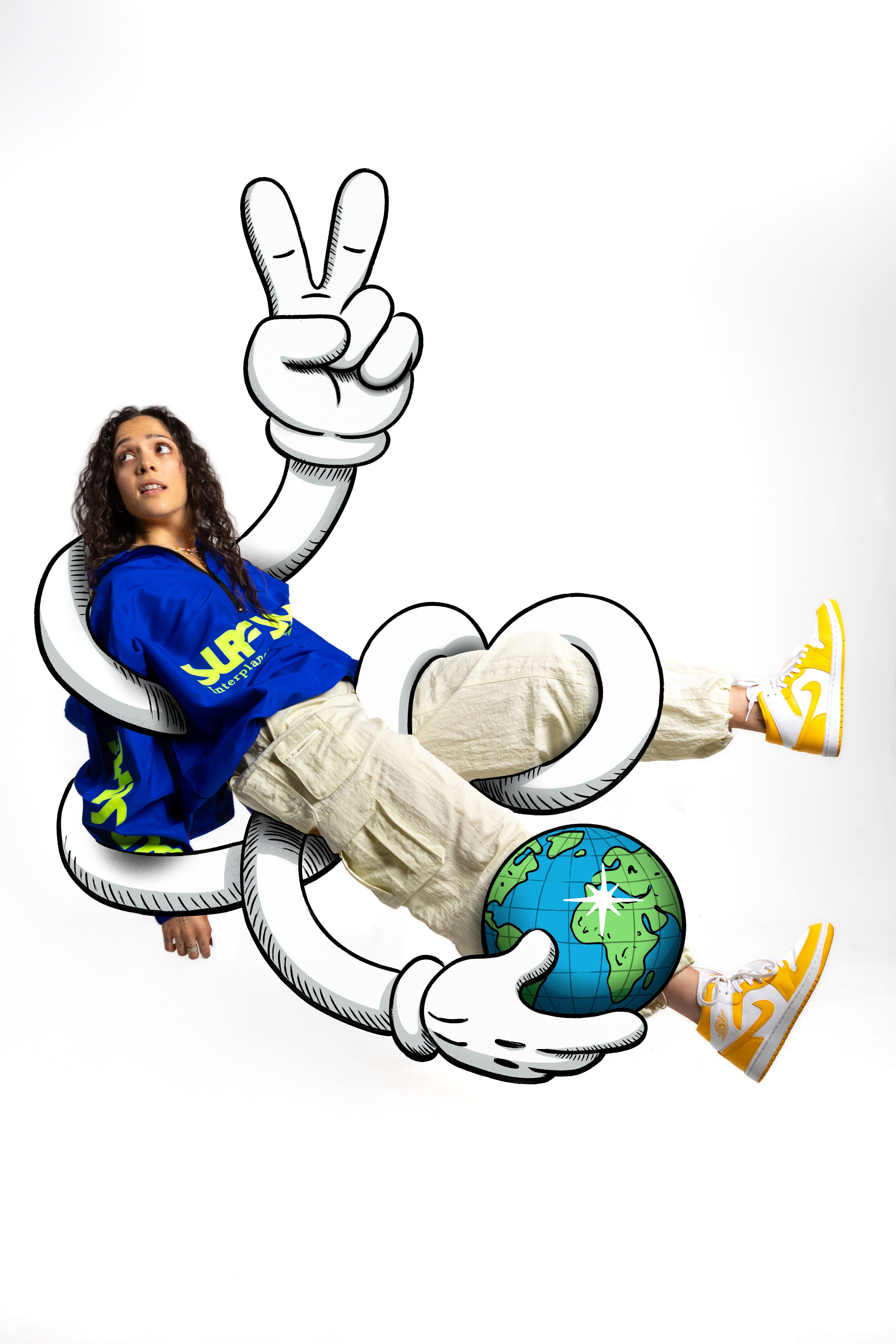
This project started with a nod to KAWS’ subway posters but evolved into its own visual language, rooted in vintage rubber-hose animation and expressive line work. Instead of relying on a static logo, the goal was to build a flexible identity for a musician, something that could live across Spotify and Apple Music headers, social platforms, event promos, and future releases. A brand that moves with her, not over her.
With the theme “To The World,” the illustrations explore two ways an artist sends something outward: as a direct message, and as a world that grows around her.
In the first piece, the peace symbol becomes the word “to,” and the cartoon character finishes the phrase by holding the world. Its rubber-hose arms wrap around Joyia like a framing device, amplifying her without boxing her in. Gritty shading and vintage animation cues give the character the feel of a recurring motif, recognizably hers without acting like a literal logo. The contrast between the stylized figure and the portrait photography creates a visual tension that feels both modern and nostalgic.
In the second piece, “the world” becomes something that grows, an ecosystem of expressive flowers, small characters, and climbing vines that build a scene around her. The illustration is grounded in the portrait and composed to adapt cleanly across wide headers, vertical formats, and social feeds. Here, branding comes through tone, colour, and personality rather than a fixed mark, creating a visual universe she can expand as her music evolves.
Both illustrations were drawn and refined in Procreate. Together, they form a cohesive visual language where bold graphic motifs and soft organic growth shape the artist’s message, an identity that behaves like strong musical branding: instantly readable, emotionally warm, and adaptable, where the world itself becomes the brand.