


XmachinAI Branding
The XmachinAI logo embodies the brand’s mission of transforming complex data into actionable insig
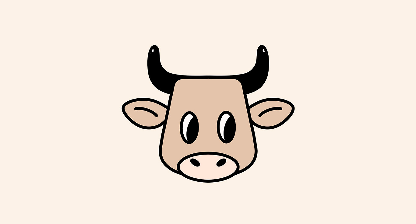
Moomu Branding
not oat. not nut. not sorry. MOOMU is a concept dairy brand that doesn’t beg for relevance, it bui

Kaffi Nordic Roasters Branding & Packaging
Est. 1980 – A legacy brewed in the north. KAFFI is a conceptual Nordic coffee brand rooted in trad