Moomu Branding
not oat. not nut. not sorry.
MOOMU is a concept dairy brand that doesn’t beg for relevance, it builds its own. Created to stand out in the alt-milk aisle, MOOMU blends full-fat nostalgia with Gen Z wit and hand-crafted design to reframe how dairy shows up in the world.
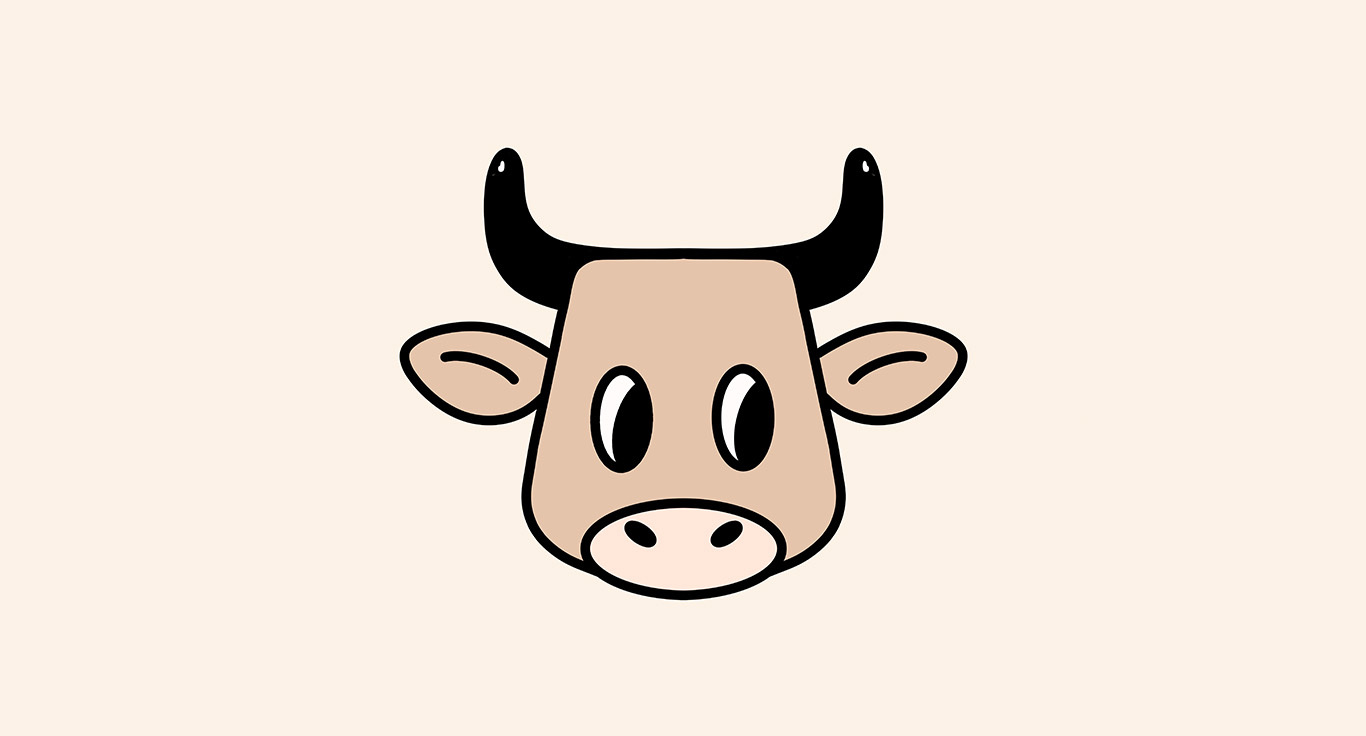
This project includes a hand-drawn logotype, custom mascot design, and full packaging system, extending into merch and colour direction. The illustrated cow—wide-eyed, chunky, and unbothered—anchors the brand with cartoon charm and cultural confidence.
The visual system blends organic curves with bold, unexpected tones: Desert Sand, Eggplant, Midnight Green, and Celeste work together to disrupt typical dairy colour cues while still feeling natural and ownable. The packaging is intentionally minimal but loud, letting the voice and mascot do the talking.
The tagline “not oat. not nut. not sorry.” captures MOOMU’s unapologetic stance, dairy for a generation that likes their milk with some edge.
Black Rabbit Branding
Visual Identity, Packaging, and Merchandise Design This branding concept was developed for Black Rab
mystery Mansion
National Campaign Concept + Experiential Getaway Mystery Mansion was a concept for a national Coors
Great West Life Print Campaign
Designed a print campaign for Great-West Life’s Flexbox service, which provides flexible insurance


