A cracked smartphone floats in mid-air surrounded by shattered glass and debris, set against a cloudy, storm-like sky. The image evokes a sense of impact and fragility.

It’s Just a Back Button. Until You Drop Your Phone

A rethink on gestures, ergonomics, and the quiet hostility of top-left nav.

Ever try to go back on a mobile screen and almost drop your phone in the process?
Yeah, that’s not a user problem. That’s a design problem.

🧠 The Back Button Isn’t Broken. But It Breaks Us

Let’s talk about a dark pattern that somehow still survives in 2025: the top-left back arrow on mobile.

You know the one.
The “good luck reaching me” one.
The “balance your phone on a dying pinky” one.
The “stretch like you’re defusing a bomb mid-jog” one.

If the only way to go back in your app is that lonely little arrow, you’re not building a mobile experience. You’re designing a trap.

And with plus-size phones now the norm, that reach isn’t just awkward. It’s often 13 to 15 centimetres diagonally from thumb rest to top-left corner. That kind of movement breaks flow, breaks posture, and sometimes nearly breaks the phone.

A screenshot of the iPhone Notes app with an arrow pointing to the top-left "All iCloud" back button. Below it, in bold black cursive handwriting, the text reads: "It’s Just a Back Button. Until You Drop Your Phone." The image humorously emphasizes the difficult reach required to tap the back button on mobile.
Designing for mobile means designing for hands. If your back button lives up here with no gesture support, you’re betting on thumb gymnastics.

👎 No Left-to-Right Swipe? That’s Not Minimal. It’s Malpractice

Swipe-to-go-back from left to right has been standard on iOS for over a decade. Android has had variations too.
This isn’t a feature. It’s muscle memory.

Breaking that flow doesn’t feel clean or intentional. It just feels broken.

UX isn’t just about what users see. It’s about how they move. And forcing them to stretch across a glass slab one-handed doesn’t feel modern. It feels like punishment.

If I drop my phone because your product designer left out swipe-to-go-back, you should be replacing it. Screen and case. No questions asked.

💁‍♀️Lefties Notice Too. Just in Different Places

Roughly 10 percent of people are left-handed. For them, reaching the top-left corner is easier. But that top-right menu icon? Same problem, mirrored.

The issue isn’t handedness. It’s reach. Every extreme corner becomes a thumb test when screen sizes grow but hands don’t.

⚠️ When Friction Actually Makes Sense

There are moments where friction is justified:

💳 Confirming a payment
🗑 Locking down a destructive action

In those moments, pause is intentional. But making users fight muscle memory on a standard screen transition isn’t thoughtful. It’s regressive.

Back should mean back. Not “solve this thumb puzzle first.”
If you wouldn’t place a checkout button in a spot only accessible with index finger yoga, don’t do it to the back button either.

An infographic titled “Mobile Usability” showing thumb reach zones on a smartphone screen. The screen is divided into three coloured areas: red (“Hard”), yellow (“Stretch”), and green (“Easy”). It also shows how users typically hold their phones: 49% one-handed, 36% cradled, and 15% two-handed. Annotations highlight that the top-left corner is hard to reach one-handed, while the bottom right is comfortable.

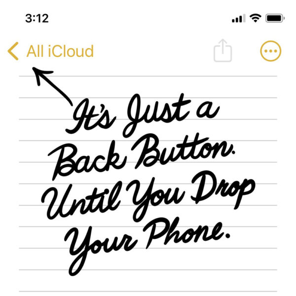
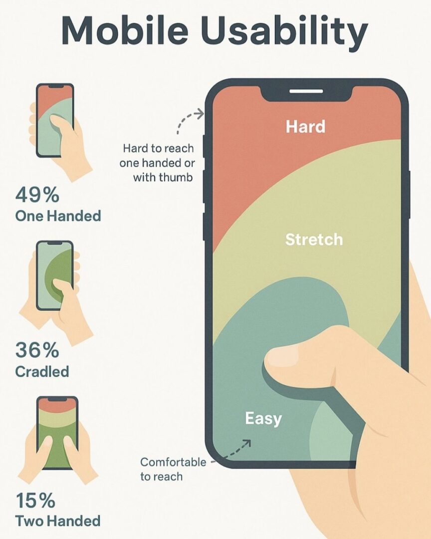
Almost half of users operate their phones one-handed, yet key actions like back navigation still live in the hardest-to-reach corner. This is what poor mobile ergonomics looks like.


📱 Real Mobile Design = One-Hand Friendly

Some reminders for your next sprint:

  • If users can’t go back with one hand, your app isn’t mobile-friendly
  • If they almost drop their phone trying, that’s a design failure
  • If you’re adding friction to stretch engagement, congrats. You’ve built a dark pattern

Design with intent, not inertia. We know better now.

☝️ P.S.

If your rage taps and bounce rates spike on a screen with no swipe exit, that’s not user error. That’s a mirror.