
UX for Power, Not Politeness
🎚 Where Complexity Isn’t a Bug, It’s the Culture
Music producers use tools that would make your average product manager cry. Digital Audio Workstations (DAWs) like Ableton Live, Logic Pro, or FL Studio aren’t just feature-rich. They are entire ecosystems. Then come the plugins: synths, samplers, compressors, modular sequencers. Interfaces that feel like operating systems inside operating systems.
To a producer? Muscle memory.
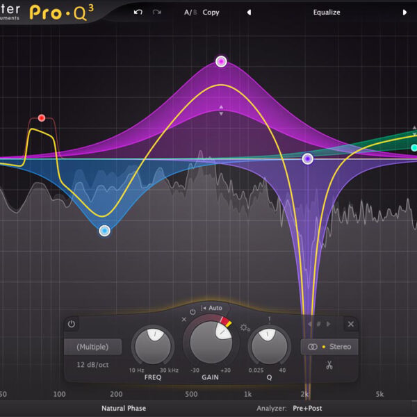
- Feedback that’s immediate (watch how FabFilter Pro-Q reacts in real time)
- Performance that’s tight and fluid, even under CPU stress
- Consistency within chaos (a Kontakt library looks wild but behaves predictably)
- Progressive disclosure that lets users grow into power
Most importantly, they respect the user’s intelligence. No walkthroughs. No explainers. Just trust, curiosity, and depth.
🧠 Simplicity Isn’t Sacred
UX culture tends to worship simplicity. But music plugins break that rule daily and still feel usable, learnable, and deeply rewarding.
ValhallaRoom is simple in form but massive in possibility.
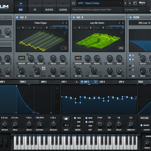
Serum is visually dense, yet every control feels intuitively placed.
Effectrix looks like a glitch sequencer from another timeline, but its visual rhythm teaches you as you play.
Music software shows us that functional density doesn’t have to overwhelm. It just needs to be structured with intent.
🎛 Style Isn’t Decoration, It’s Instruction
Most apps follow trends. Plugins invent their own logic.
No one is chasing Material Design or Apple’s HIG in this world. Every synth has its own language. Every compressor its own voice.
UI here isn’t just about clarity. It’s about feel. About vibe.
- FabFilter succeeds because it looks like surgical gear
- Valhalla plugins feel like minimalist hardware from a parallel universe
- Arturia’s synths behave like the analog machines they emulate
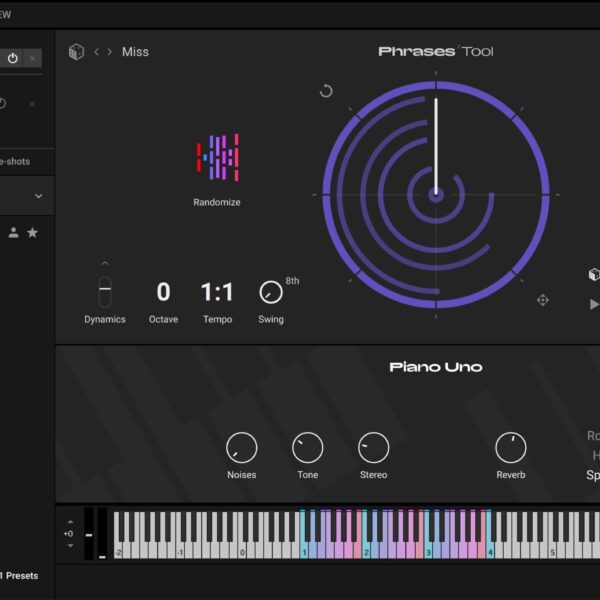
- Kontakt breaks every design system rule yet remains one of the most widely adopted platforms in music
Plugins don’t follow style guides. They are style guides.
🎚 Hardware UX Still Wins the Tactile Game
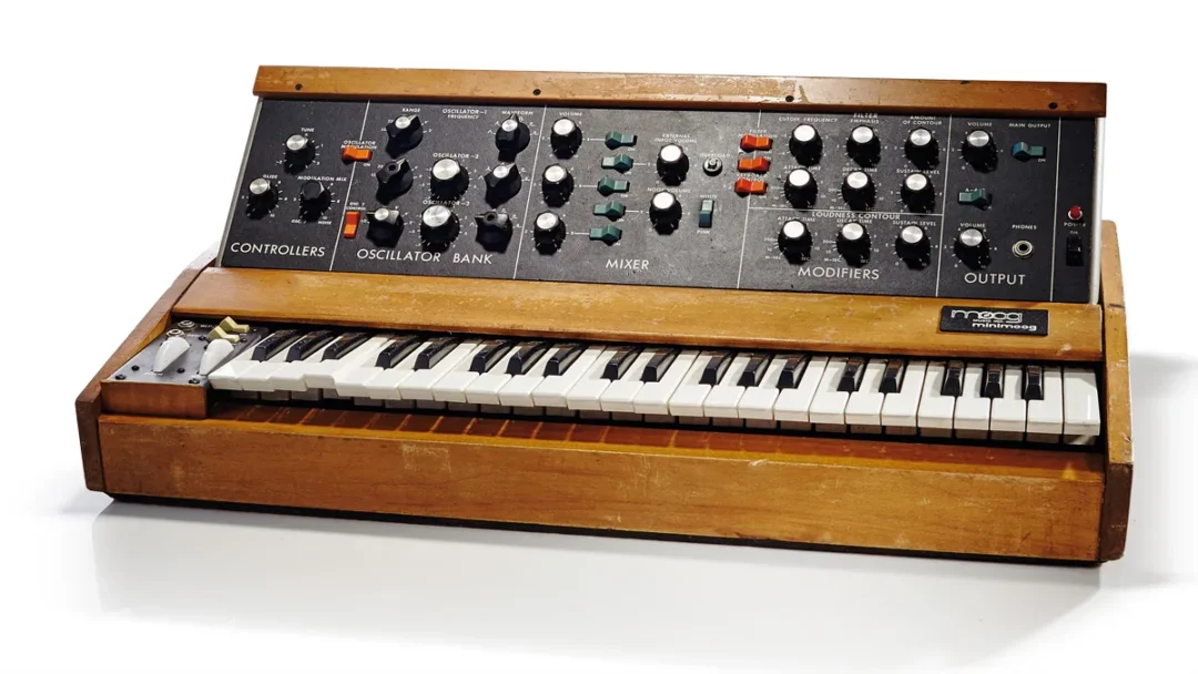
When was the last time a mobile app made you want to touch it? Music hardware doesn’t care about invisible UX. It wants to be touched, turned, tapped, and triggered. Every control has weight, resistance, and satisfaction. The tactile experience of twisting a Moog’s cutoff knob or slamming a drum pad is better UX than most of what we call “delightful.”This is affordance done right: form, feedback, and function in perfect harmony.
🎵 A Personal Note
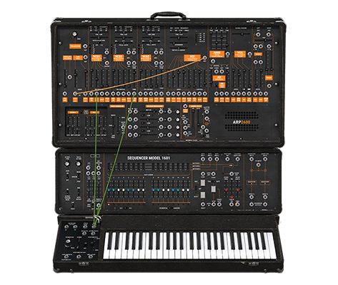
When I was first learning to produce music, I opened the Arturia ARP 2600 V3 inside Reason and just stared.
It looked like an alien rack of wires and knobs, straight out of a Cold War lab. It was dense. It was unapologetic.
And somehow, I got it.
Not all at once. But the layout, the labels, the patch cables — they invited exploration, not frustration. I wasn’t being walked through anything. I was being dared to figure it out.
That moment shaped how I view product design. If something looks interesting, feels alive, and rewards curiosity, I’ll learn it.
So will your users.

It’s Just a Back Button. Until You Drop Your Phone
A rethink on gestures, ergonomics, and the quiet hostility of top-left nav. Ever try to go back on a
Agent-Aware UX: Designing for Humans and AI
🧠 A visual guide to FRAME—the 5 pillars of AI agent UX There’s a new kind of user inside your

Free Seamless Pattern Images
Hey there! Want some free seamless patterns? Go ahead, take ’em! But listen up, buddy: if you