The Cat That Carried a Nation
What Kuroneko Teaches Us About Brand Trust
Some logos shout. This one whispers.
A black cat carrying her kitten. No text. No slogan. Just a gentle silhouette, frozen mid-step. In Japan, you don’t even need to see the full image. A flash of yellow and black, the curl of a tail, and you already know — it’s Kuroneko. And your package is in safe hands.
What makes it brilliant isn’t just recognizability. It’s emotion. It’s one of the few corporate marks that isn’t about the company at all. It’s about you, trusting a stranger with something that matters.
If you’ve been to Japan, you’ve seen it. And even if you haven’t, the idea probably still feels familiar, because great branding doesn’t need translation.
What started in 1919 as a logistics company has become one of the most beloved household brands in Japan. Not just because they’re fast, efficient, and everywhere, but because their identity does something most brands only dream of. It makes people feel taken care of.
The surprising part? That iconic cat didn’t arrive until almost 40 years later.

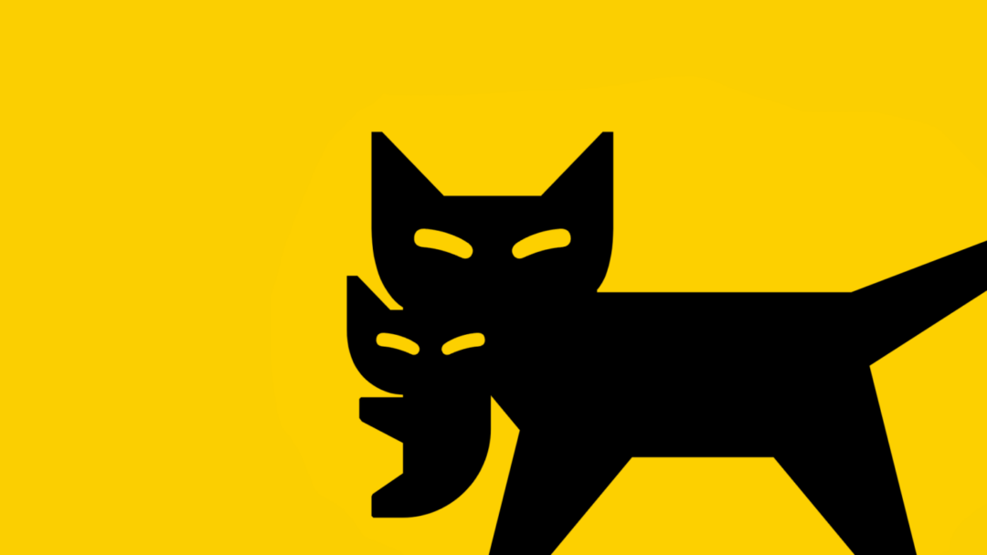
The Kuroneko logo has remained virtually unchanged since 1957 — a rare example of a brand mark so emotionally resonant it doesn’t need an update.
A Logo That Doesn’t Look Like a Logo
Let’s be honest. A cat carrying her kitten doesn’t exactly scream logistics. If anything, it looks like something pulled from a children’s book. And that’s the genius.
The image evokes care without needing to explain it. No arrows. No boxes. No speed lines. Just an instinctive symbol of safe handling, borrowed from nature. And in Japan, where cats represent guardianship, protection, and luck, the message lands instantly.
Kuroneko’s logo isn’t built for scalability or modernism. It’s built for trust. And because it’s so gentle, so unlike anything else in the category, it becomes unforgettable.

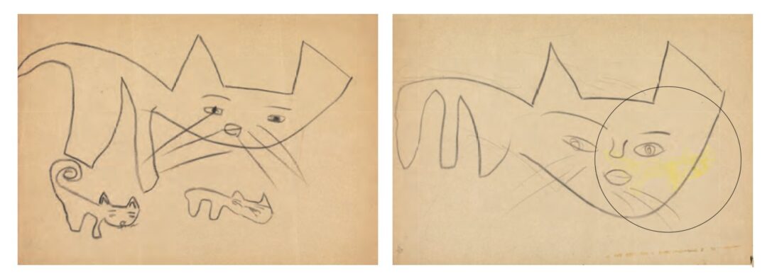
These childhood sketches by the designer’s daughter became the unlikely starting point for one of the most enduring brand marks in Japan. The emotional clarity was there from the beginning.
A Daughter’s Drawing as Inspiration
When Yamato decided to adopt a visual identity in 1957, they didn’t hire a global agency. Their in-house PR designer, Takeshi Shimizu, turned to a drawing made by his young daughter. Her crayon sketch of a mother cat gently carrying her kitten became the foundation of the final design.
Soft. Uncommercial. Deeply human.
It didn’t need a wordmark. It already told a story.
The Power of Obscurity
Most modern logos are over-engineered. Built to be legible at 16 pixels, compliant across devices, and stripped of texture. Kuroneko didn’t do that. They chose something tender. Visually unusual. Emotionally precise.
It doesn’t even look like a logo. It looks like a moment.
And that’s why it sticks.

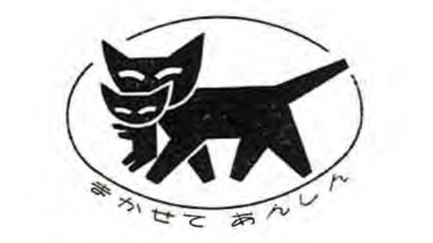
The official 1957 debut of the Kuroneko mark, paired with the catchphrase “Leave it to us for peace of mind.” A rare case where the image says exactly what the tagline does — without needing to.
Mapping Meaning to Design Decisions
- In 1957, a licensing agreement with Allied Van Lines and a child’s drawing merged into something emotionally authentic and culturally resonant.
- Kuroneko was never the legal emblem, but it quickly became the identity people saw, remembered, and trusted.
- Over time, it stopped being a logo and became a symbol. Not just of Yamato, but of parcel delivery in Japan.
Consistency Builds Legacy
Kuroneko’s logo hasn’t leaned into trends. No minimalist refresh. No gradient. Just the same cat and kitten, faithfully delivering parcels and peace of mind for almost 70 years.
In a world of constant rebrands, Kuroneko shows that consistency paired with quality is its own kind of modern. They didn’t chase aesthetics. They anchored in symbolism.
Emotion Is More Memorable Than Function
FedEx hides an arrow. Amazon smiles from A to Z. Kuroneko simply says, “We’ll carry your cargo like we’d carry our own.” The metaphor is so quiet and powerful, it doesn’t need explanation.
It’s maternal. Protective. Gentle. And completely at odds with what you’d expect from a logistics company.
It’s not about speed. It’s about care.
Branding Isn’t What You Say. It’s What You Repeat
Kuroneko doesn’t flood the market with slogans. They don’t pivot every quarter. Their brand is a masterclass in restraint. You see it in the trucks. The tape. The uniforms. The experience.
Every part of the business quietly repeats the same message, your package matters.

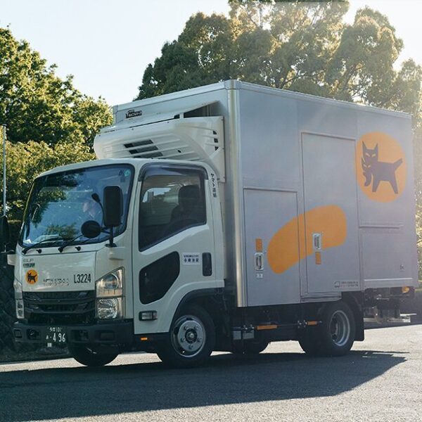
Decades later, the Kuroneko logo still rides shotgun. Proof that when a brand mark is built on emotion and trust, it doesn’t need to evolve — it just needs to show up.
Cultural Integration Equals Brand Strength
In Japan, Kuroneko isn’t just a company name. It’s a shorthand for safe delivery. A symbol of dependability. A verb.
That kind of cultural integration doesn’t come from a clever campaign. It comes from years of operational integrity and emotional alignment. Kuroneko isn’t just a brand.
It’s infrastructure.
THE QUIET POWER OF SHOWING UP
When you look at the Kuroneko logo today, you’re seeing layers of meaning. A century of logistical excellence. A symbol licensed from a partner, softened by a child’s hand. A story so quietly confident, it doesn’t need to explain itself.
In the West, rebranding is often how companies signal change. But Kuroneko shows that when your values are clear and your service is consistent, you don’t need to rebrand.
You just need to keep showing up like you mean it.
P.S. Yes, Yamato has a modern digital platform. Yes, they’ve evolved. But they’ve done it without breaking the visual or emotional continuity that made people care in the first place.
That’s not just branding. That’s devotion.
The Shape of a Voice
What design thinking really teaches us, and who it leaves out when we forget. The other day, I came
Free Seamless Pattern Images
Hey there! Want some free seamless patterns? Go ahead, take ’em! But listen up, buddy: if you
Agent-Aware UX: Designing for Humans and AI
🧠 A visual guide to FRAME—the 5 pillars of AI agent UX There’s a new kind of user inside your


