
Lake Ontario at dusk, with a snow-covered breakwater beneath a pink sky.

The Last Mile Is Judgment

What MapQuest, Figma, Sonos, and a confused lake can teach us about the limits of data-driven product design.

MapQuest Is the #1 App in America. Somehow.

MapQuest is the most downloaded free app in the United States.

Yes. MapQuest.

The company you probably last interacted with when someone printed six pages of directions before a road trip is, at the time of writing, sitting above ChatGPT in Apple’s App Store.

It did not launch an AI assistant. It did not reinvent navigation.

It correctly labelled a lake.

This is, somehow, a product strategy story.
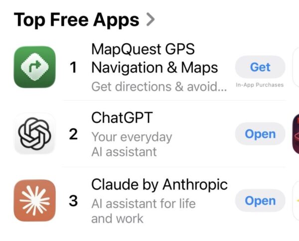
Apple App Store rankings showing MapQuest as the number one free app, ahead of ChatGPT and Claude.

MapQuest at #1, ahead of ChatGPT and Claude. 2026 continues to be a very normal year.

On August 27, Donald Trump signed an executive order directing the U.S. government to rename Lake Ontario “Lake America,” amid an escalating trade dispute with Canada. Google Maps updated the name for U.S. users. Apple followed shortly afterward. Canadian users still see Lake Ontario, because apparently geography now has localization settings. (Reuters)

Even the two big tech companies arrived there differently. Google followed its established practice of reflecting official government geographic sources. Apple’s change came after Interior Secretary Doug Burgum said Trump had called the company directly asking it to make the switch. 

MapQuest went another way.

“We’re not changing it,” the company announced. Then, rather than issuing the usual corporate statement about its unwavering commitment to geographical nomenclature or whatever, it leaned into the absurdity and launched a tool that let people make up their own names for the lake.

People responded.

Hundreds of thousands downloaded the app. MapQuest says usage rose to roughly 50 times its normal level. And a mapping product launched in 1996 found itself at the top of the App Store in 2026. (CBS News)

MapQuest has not defeated Google Maps.

A viral download spike is not retention. It isn’t market share. Apple and Google will survive this. There are probably people downloading MapQuest right now who will forget they have it by Friday.

That’s almost beside the point.

Because for one strange moment, the company with less money, less technology, less data, and less market power made the product decision people preferred.

And it didn’t need an experiment to get there.
The Decision No Dashboard Could Make

Google’s decision wasn’t irrational. That’s what makes it interesting.

Mapping products need standards. A company operating a global map cannot convene a cross-functional workshop every time somebody disputes the name of a mountain. Google has an established policy of using official government geographic sources, and the U.S. Geographic Names Information System had been updated. Reuters

The system did what it was designed to do, and produced something a lot of people thought was ridiculous.

No experiment would have prevented that.

Do we A/B test Lake Ontario against Lake America? Measure lake-name engagement? Track whether Lake America improves conversion among people looking for directions to Rochester?

For some questions, the machinery of modern product development doesn’t help much.

You can’t A/B test a spine.

But spine isn’t quite the whole thing.

Sometimes what you need is conviction. Sometimes it’s foresight or restraint. Sometimes it’s knowing when users are right about what they’re experiencing but wrong about what they’ll eventually prefer. And sometimes it’s knowing when a rule is producing an outcome nobody intended.

All of these are different forms of the same underrated skill: judgment.

Research Is Evidence, Not Democracy

“Trust your judgment” can quickly become designer-speak for “I ignored the research because I liked my idea better.”

That’s not judgment. That’s ego with a Figma license.

User research is valuable. So is usability testing. So are analytics, experimentation, customer interviews, behavioural data, and the many other ways we try to understand what people do instead of what we imagine they do.

The problem starts when we ask those methods to answer questions they can’t answer.

Apple is good at making me hate things I eventually can’t imagine living without.

A familiar interaction changes, something moves, and a behaviour I’ve repeated thousands of times suddenly works differently.

My immediate reaction is often extremely sophisticated: this sucks.

Then a few months pass.

The new interaction becomes invisible. I understand why it works the way it does. Eventually I use an older device and discover that the old behaviour now feels worse.

My original reaction wasn’t wrong.

If you’d put me in a usability study on day one, I would have accurately reported that the new interaction was frustrating. That study would have measured the cost of adaptation, not the quality of the interaction once I’d adapted to it.

Those are different things.

This is easy to acknowledge and hard to design around.

Apple can afford enormous amounts of research. Most companies can’t run a six-month longitudinal study every time they change an interaction. Products are used for months and years; research windows are often measured in days and weeks.

Eventually, somebody has to decide.

Good judgment means knowing what your evidence can tell you, and knowing what it can’t.

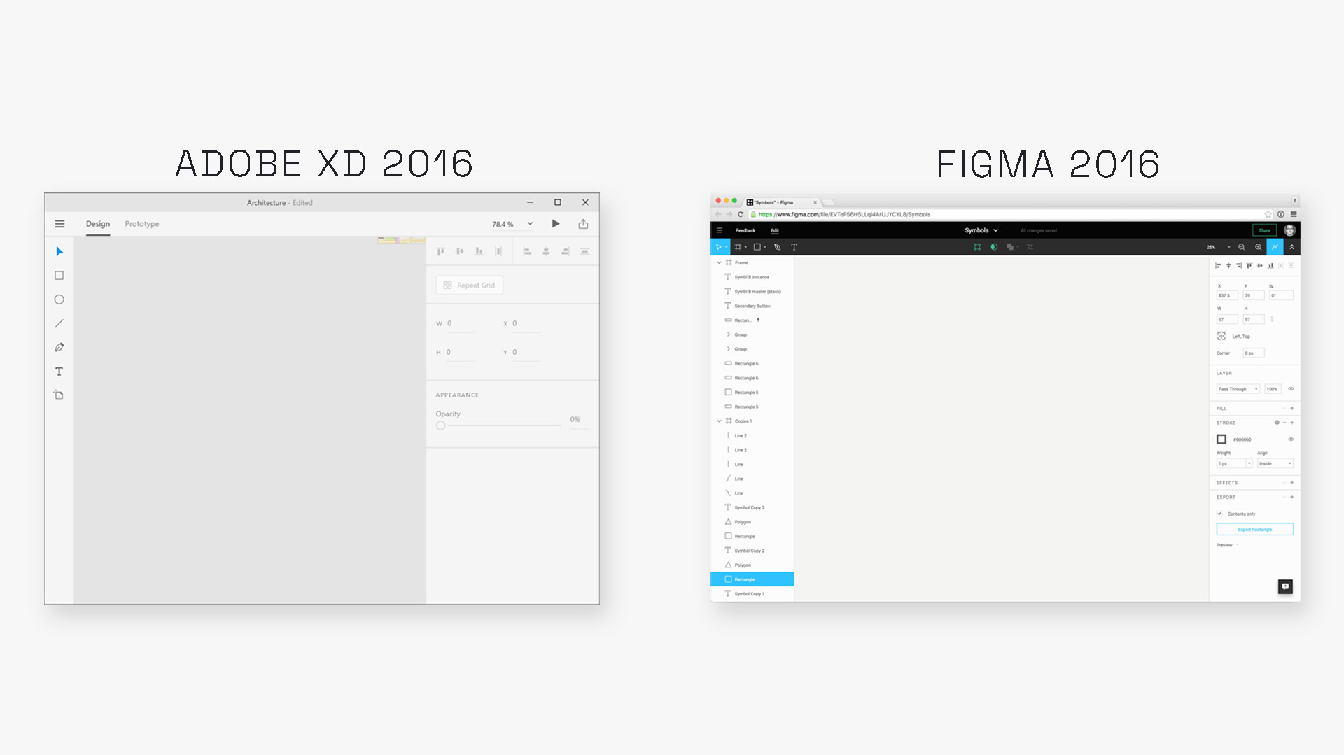
Adobe XD and Figma interfaces from 2016 shown side by side, with XD as a desktop application and Figma running in a web browser.
Adobe XD and Figma in 2016. Similar tools on the surface, but built from very different assumptions about where design work was headed.

Sometimes the Past Is the Problem

Adobe had something Figma didn’t: a successful past.

That history is valuable. It’s also heavy.

Open Photoshop today and you are not looking at a product that someone sat down and designed from scratch in 2026. You’re looking at something closer to an archaeological site of professional creative work.

There are layers, and some of them are load-bearing. And somebody, somewhere, still needs that one weird panel you haven’t opened since 2014.

This isn’t necessarily bad design. It’s the cost of continuity.

When millions of professionals depend on a tool, “let’s just rethink the whole thing” threatens their workflows more than it improves the design.

Adobe XD should have been different.

XD gave Adobe the opportunity incumbent companies rarely get: a new product for a new discipline. Permission to forget some of its own past.

But Adobe still approached the problem with decades of assumptions about what professional creative software was supposed to be.

Figma had no such obligation.

Sketch had already demonstrated that interface design could move away from the traditional Adobe creative-suite model. Figma got to look at Adobe, look at Sketch, look at how product teams were changing, and ask a more dangerous question:

If none of this existed, what would we build now?

The answer was a design tool that lived in the browser and increasingly behaved less like a document you owned and more like a place your team went.

Figma’s multiplayer editing is especially instructive because users weren’t begging for it. Figma has written that designers initially worried live collaboration would create “hovering art directors” and design-by-committee disasters. The company built it anyway because multiplayer felt like a natural consequence of designing on the web. The bet became one of Figma’s defining advantages: one URL, one current version, and a shared space where designers, developers, writers, and product managers could work around the same thing. (Figma)

That is judgment.

Figma didn’t ignore users. It understood something about where the work was going that users didn’t yet know how to ask for.

Adobe had the customers, the distribution, the brand, the resources, the creative ecosystem.

Eventually, it offered $20 billion to acquire Figma. The deal collapsed after the companies concluded there was no path to regulatory approval. XD faded away.

There’s something almost too neat about that ending.

The incumbent had nearly every structural advantage. The challenger had fewer inherited assumptions.

One of the hardest questions in product design is deciding which parts of the past are accumulated wisdom, and which are accumulated baggage.

There is no metric that answers it for you.

Sometimes Your Users Really Are Telling You That You Screwed Up

There is, however, a dangerous conclusion you could draw from the Apple and Figma examples:

Users resist change. Visionary product teams push through it. Eventually everyone realizes the designers were right.

Please do not print that on a poster.

Sometimes users hate your new product because your new product is bad.

Sonos provided an expensive demonstration of this in 2024.

The company rebuilt its app from the ground up. The rationale was sensible: modernize the interface, create a more modular platform, and make it possible to innovate faster in the future. It was strategic, scalable, and exactly the kind of plan that plays well in a board deck.

There was one issue: the new app made people’s speakers harder to use.

Customers encountered missing features, setup problems, and reliability issues. Sonos eventually acknowledged that the rollout increased complaints and dissatisfaction, hurt sales and its reputation, and forced the company to delay two product launches. It estimated the remediation effort could cost up to $30 million. (SEC)

Compare that with the Apple example.

“I don’t like where this button moved” and “I can no longer reliably use the expensive hardware I already bought from you” are both negative user feedback. They are not the same signal.

“Listen to users” isn’t enough on its own. Neither is “users don’t know what they want.”

The actual work is harder.

You have to figure out whether you’re observing the discomfort of learning something better or the frustration of something that has gotten worse.

There isn’t a dropdown in your research repository for that.

Trust Can Become a Feature Overnight

WhatsApp learned a related lesson in 2021.

After WhatsApp announced a privacy-policy update, users pushed back hard over concerns about how their data could be shared with parent company Facebook.

Signal, a much smaller messaging app built around privacy, grew fast.

Its weekly downloads jumped from roughly 285,000 to 17.8 million. WhatsApp’s fell during the same period. (Reuters)

Signal didn’t invent messaging that week, and it didn’t ship some revolutionary new button. Something it already represented, trust, suddenly mattered more.

WhatsApp remained enormous. Signal didn’t kill it, just as MapQuest isn’t about to put Google Maps out of business.

Both moments are a reminder of something product teams tend to forget: not everything users value lives inside the interface.

Trust rarely shows up in a feature comparison table, until suddenly it’s the thing people are choosing between.

More Isn’t Automatically More Product

The wearables market is running another version of this experiment.

Products like WHOOP and Oura can produce a lot of information about your body: recovery, readiness, sleep, strain, coaching, trends, recommendations, increasingly AI.

For some people, that is exactly what they want.

For other people, the desired product might be closer to:

Can you tell me how I slept and whether I should go for a run today? Thanks.

WHOOP has made a deliberate bet that the ongoing analytics and coaching layer is valuable enough to make membership central to the product. That may be completely right for its most committed users. They may not be buying a sensor so much as paying for an interpretation service that happens to come with one.

But it’s also possible that parts of the wearables market have started confusing more data with more value.

Fitbit’s AIR and Garmin’s CIRQA bands are interesting partly because of what they don’t require. They’re screenless, track health and fitness continuously, and they’re both marketing it with three words that have become surprisingly compelling in consumer hardware:

No subscription required.

That creates a different product thesis.

If a large portion of customers mainly wants sleep, recovery, activity, and a handful of useful recommendations, a competitor doesn’t necessarily need to out-feature WHOOP. It can decide that the thing customers already bought should remain useful without another monthly bill.

That doesn’t make subscriptions inherently bad. Sophisticated services cost money, and people will pay when the value is there.

There’s a real question in there: when does more capability create more value, and when are we just adding features because we can, dashboards because the data exists, and subscriptions because somebody found recurring revenue?

Sometimes product judgment means knowing what else to build. Sometimes it means knowing when the product is already enough.

Bad Decisions Rarely Look Like Bad Decisions

Consider the rationale behind each decision.

  • We follow authoritative geographic data.
  • Users need time to learn the better interaction.
  • We need consistency with the ecosystem people already know.
  • We need a modern platform capable of supporting future innovation.
  • We need to evolve the business model.
  • We need more capability.

None of those statements is stupid, and that’s the problem.

Bad product decisions rarely arrive in Jira labelled BAD PRODUCT DECISION. They arrive as strategy, policy, research, consistency, modernization, growth, monetization, best practice.

Almost every one of those things is necessary to building good products, which is exactly why they can become dangerous.

A policy is useful until applying it mechanically produces nonsense.

Research is useful until we pretend a two-week study can predict two years of behaviour.

Legacy is useful until yesterday’s success limits what we’re capable of imagining tomorrow.

Strategy is useful until the future roadmap makes the current product worse.

Monetization is useful until extracting more value from customers begins destroying the value they came for.

The real failure is often believing the data could make the decision on its own, not ignoring it in the first place.

Mississauga skyline seen across Lake Ontario on a winter evening beneath a pink sky.
Lake Ontario, with Mississauga in the distance. Photograph by Matt Medley.

The Last Mile Is Judgment

Modern product teams have more ways to understand users than at any point in the history of the discipline.

We can watch behaviour, measure funnels, run experiments, conduct interviews, test prototypes, analyze support tickets, study competitors, model revenue, track retention, estimate technical complexity. Increasingly, we can feed all of that into AI and ask it to find patterns humans missed.

Good. We should.

But eventually you reach questions those systems cannot resolve.

Will users adapt to this? Is this business model sustainable, or exploitative? Is this strategy difficult because transformation is hard, or because the strategy is wrong? Does the fact that we can do this mean we should?

There is a gap between what the evidence tells you and what the organization ends up doing.

The last mile is judgment.

Judgment is what you do with evidence. It isn’t instinct replacing research, and it isn’t a senior designer walking into a room, saying “trust me,” and moving a rectangle three pixels to the left.

It’s knowing how much weight the evidence deserves, what it measured, what it missed, which precedent applies, and when the context has changed enough that precedent no longer holds.

And, occasionally, knowing that the lake is called Lake Ontario.

Who Has the Authority to Be Reasonable?

There is a harder organizational problem underneath all of this.

Companies need systems.

Google cannot have an executive committee personally debating the name of every geographic feature on Earth. Adobe cannot redesign Photoshop every five years as though thirty years of professional workflows don’t exist. Apple cannot reverse an interaction every time a usability participant says they preferred the old one. Sonos needs a technical strategy for what its platform becomes next.

Rules, process, and consistency are all good things.

The problem begins when the system encounters something it wasn’t designed to understand.

Then what?

Who can say:

  • The policy applies here, but the outcome is obviously wrong.
  • The research is valid, but it doesn’t answer the question we’re actually asking.
  • This is how we’ve always built it, but that doesn’t mean it’s how we should build it now.
  • The roadmap says ship, but this isn’t ready.
  • The business model says we can charge for this, but maybe we shouldn’t.

Who has the authority to be reasonable when the system is being unreasonable?

That might be one of the most important questions a product organization can ask itself.

Organizations can contain designers, researchers, engineers, product managers, analysts, and executives, each making individually rational decisions. Together, those decisions can produce an outcome no single person in the room would have chosen.

Good product leadership means building systems for making decisions, and leaving enough room inside them for someone to exercise judgment when the system runs out.

Two white swans swimming across Lake Ontario beneath a blue-purple winter sky.
Lake Ontario, still answering to Lake Ontario. Photograph by Matt Medley.

Somebody Still Has to Decide What to Call the Lake

MapQuest probably won’t be the #1 app for long.

It hasn’t developed better mapping infrastructure than Google or discovered some secret navigation technology, and hundreds of thousands of protest downloads don’t add up to a durable competitive moat.

But that’s why I like this story.

For one ridiculous little moment, one of the oldest names on the consumer internet became relevant again because it handled a decision differently.

It came down to a decision, not an interface, an algorithm, or a feature.

We should research more, test more, measure more, understand users better, use better data, and build better systems.

All of it makes judgment better. None of it makes judgment unnecessary.

Eventually, the dashboard ends.

And somebody still has to decide what to call the lake.