
Best Google Font Pairings for UI Design in 2025
🧊 Modern & Minimalist
Clean and contemporary, these pairings thrive in dashboards, SaaS tools, and content-heavy interfaces.
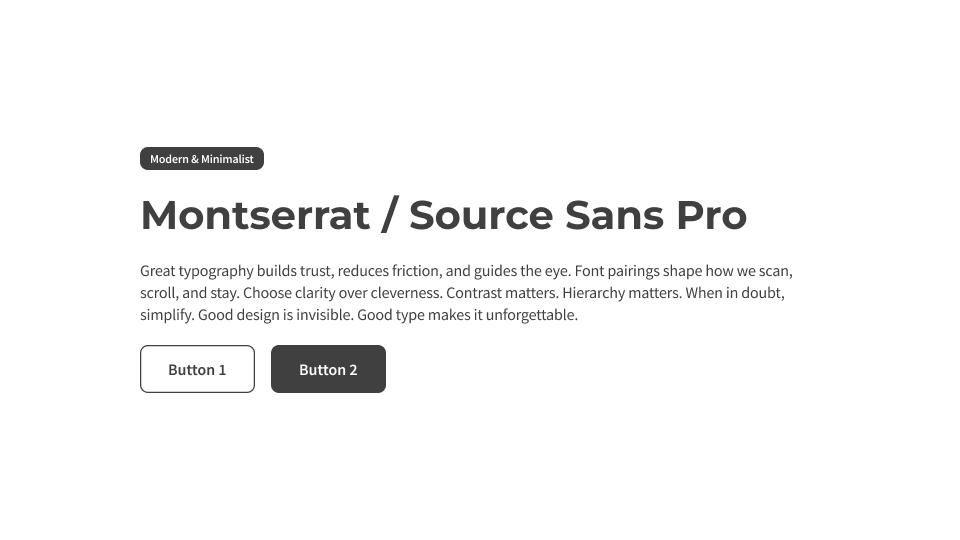
Montserrat / Source Sans Pro: A timeless modern classic—strong geometric headers meet clean, scannable body copy.
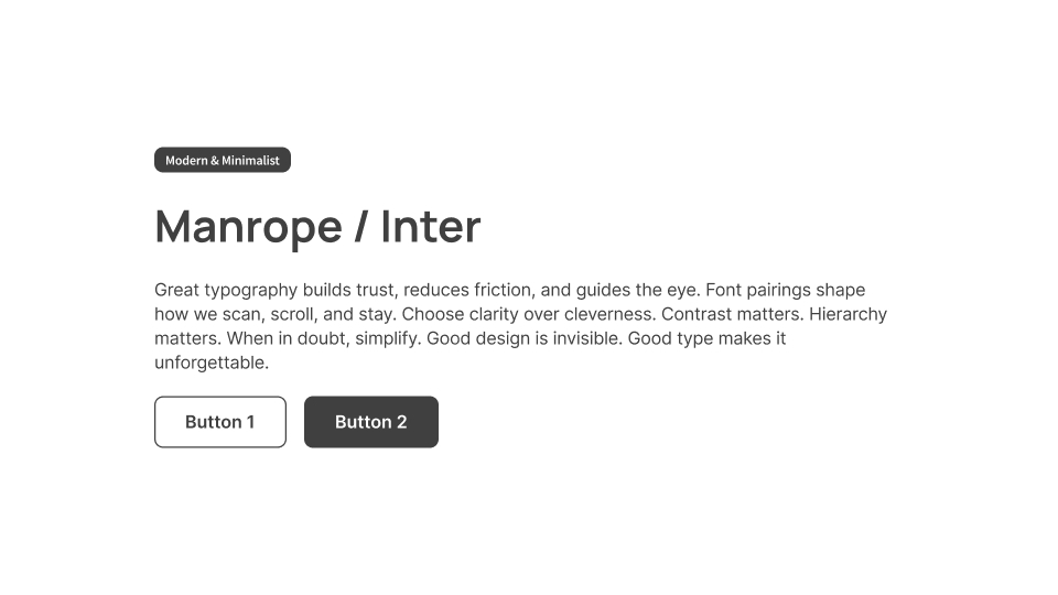
Manrope / Inter: Clear, low-friction reading at any size. Great for fintech, productivity, and admin UIs.
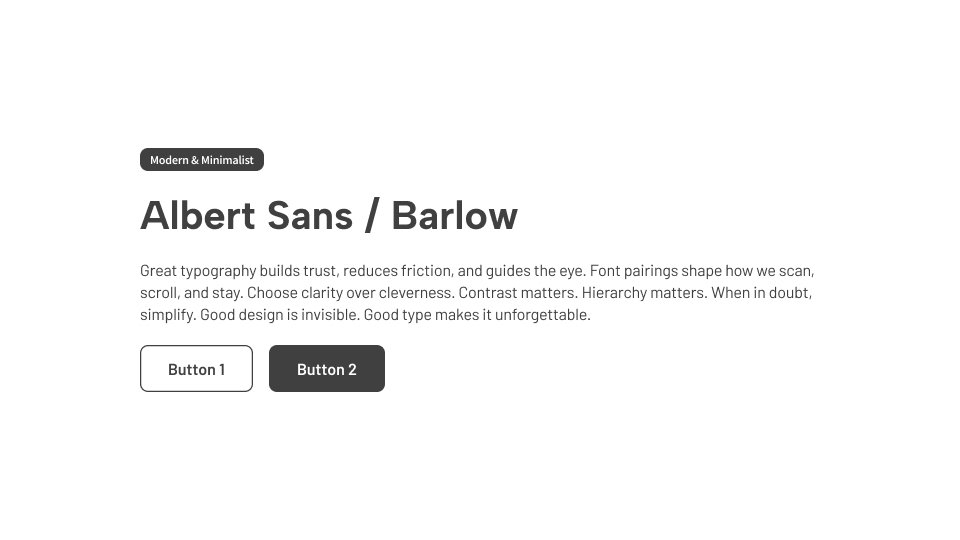
Albert Sans / Barlow: Rounded, informal, and legible—ideal for approachable web apps or personal brands.
👑 Classically Elegant
Perfect for editorial UIs, brand-forward pages, or marketing sites that need timeless character.
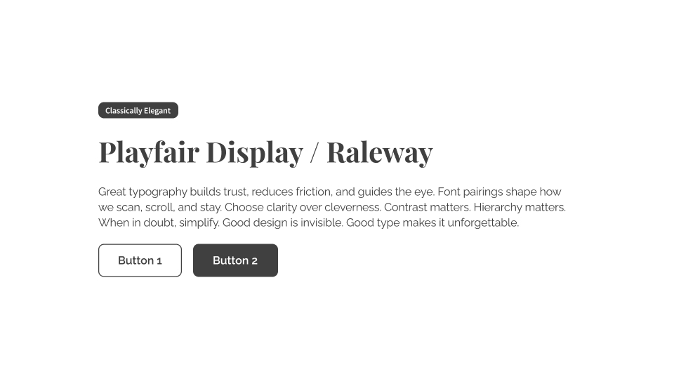
Playfair Display / Raleway: Old-world serif drama meets modern minimalist balance.
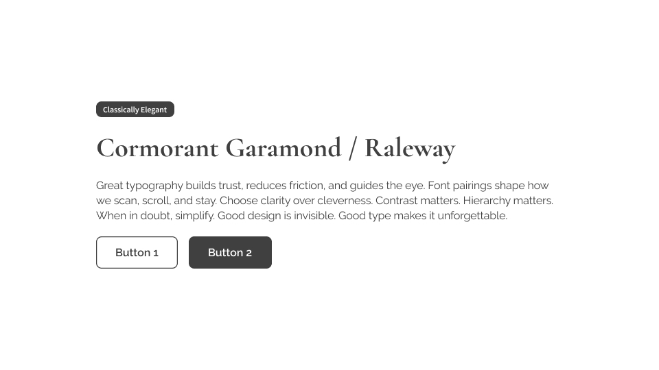
Cormorant Garamond / Raleway: A literary, high-end vibe with practical paragraph flow.
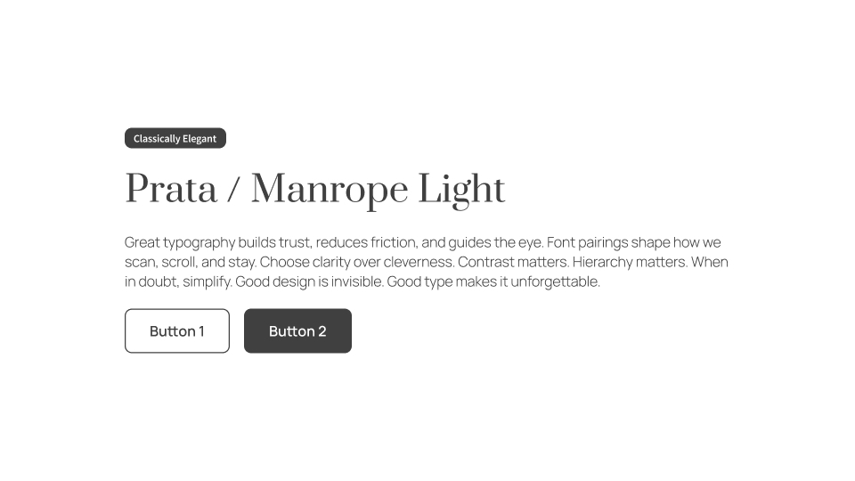
Prata / Manrope Light: For soft sophistication in landing pages or storytelling experiences.
⚡ Bold & Contemporary
For apps and sites that want to make a confident, modern impression.
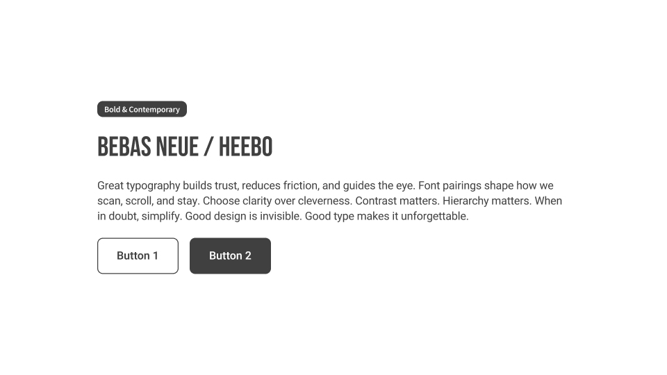
Bebas Neue / Heebo: All-caps impact up top, friendly curves below. Great for hero sections.
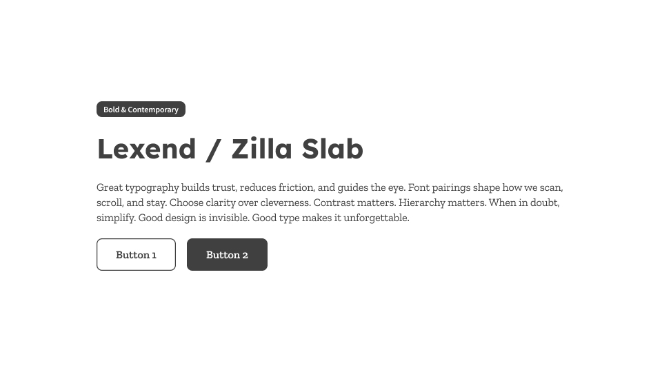
Lexend / Zilla Slab: Research-backed legibility paired with approachable editorial structure.
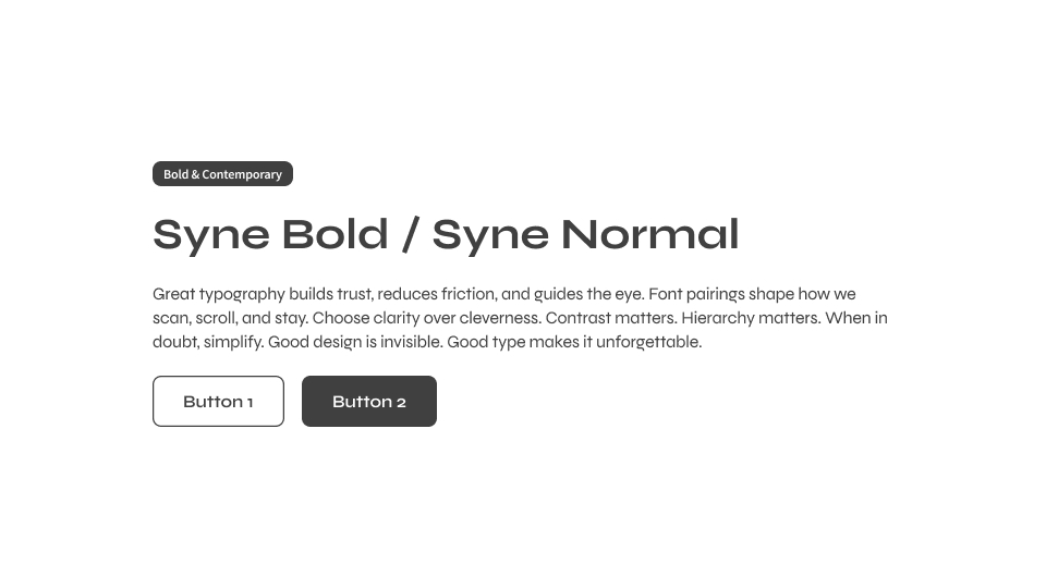
Syne Bold / Syne Normal: Variable weight control = expressive but unified UIs.
🌈 Friendly & Whimsical
Playful but still usable. These pairs are great for education platforms, onboarding flows, lifestyle brands, or kid-focused interfaces.
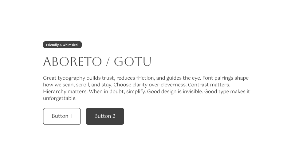
Aboreto / Gotu: Whimsical without being wild. Chic headers with calming, open body text.
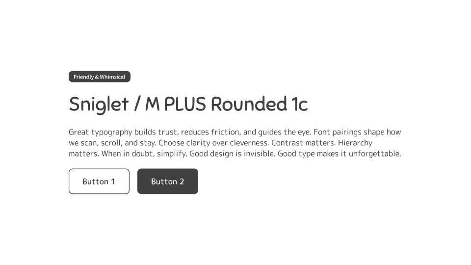
Sniglet / M PLUS Rounded 1c: Full of charm and softness. Sniglet adds bubbly personality, while M PLUS Rounded keeps things approachable and legible.
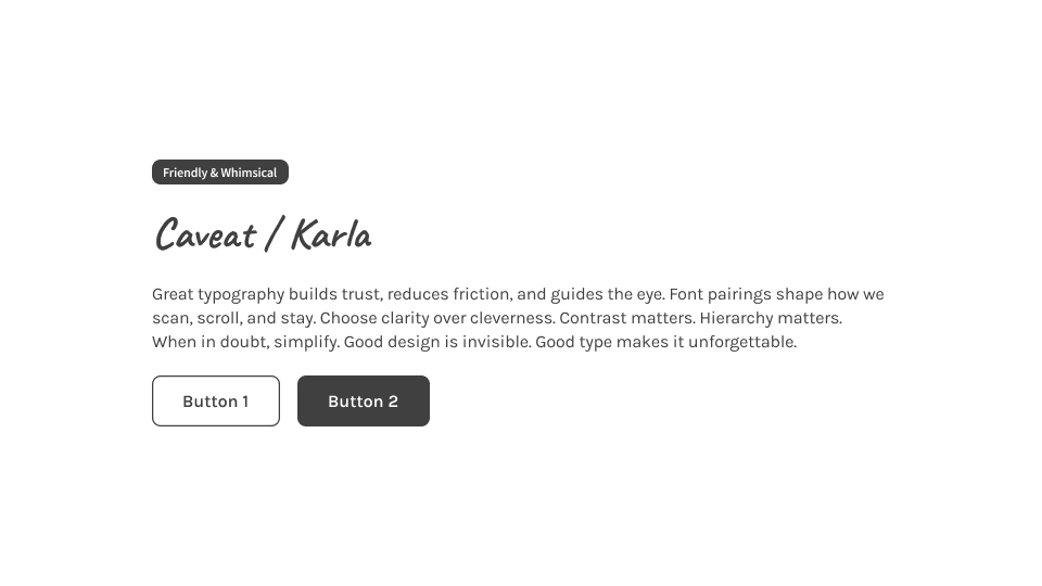
Caveat / Karla: Handwritten energy without sacrificing structure. Caveat brings warmth to headers, balanced by Karla’s clear, grounded body text.
✅ High-Readability Pairs
These battle-tested fonts are built to perform across screen sizes, languages, and devices.
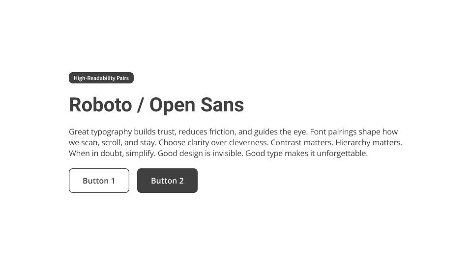
Roboto / Open Sans: A go-to pairing for good reason—stable, predictable, and readable.
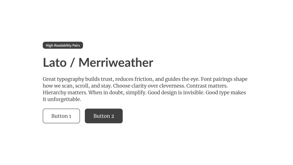
Lato / Merriweather: Legible without looking plain. Perfect for content-rich UIs.
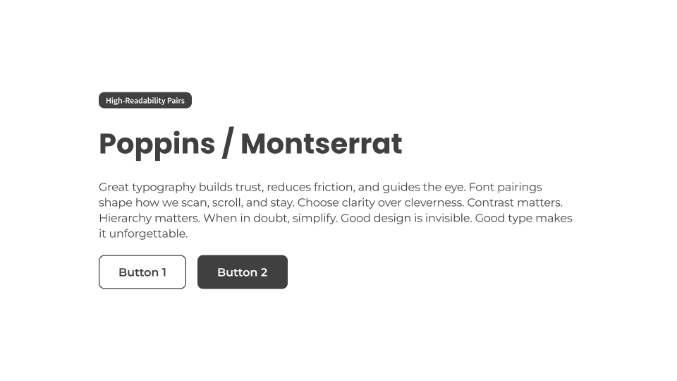
Poppins / Montserrat: Geometric with just enough personality.
💻 Tech-Optimized & Future-Proof
Performance and scalability are now part of the design brief. These pairings are built for apps that need global reach, fast rendering, and flexible UX.
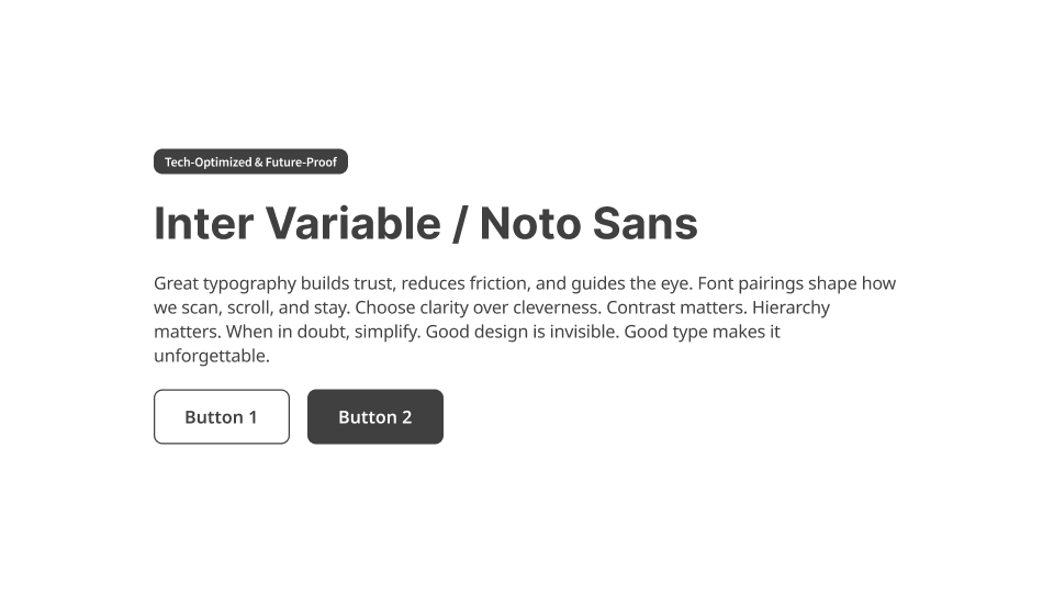
Inter Variable / Noto Sans: Inter’s responsiveness meets Noto’s multilingual power.
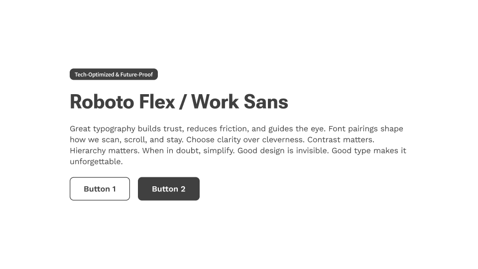
Roboto Flex / Work Sans: Variable-font ready and smooth on any screen.
🧠 Pro tip: Variable fonts reduce load times by bundling multiple styles in one file—ideal for mobile-first products.
🎨 Brand-Forward Expression
When font choice is part of the brand strategy, these combos help carry voice and tone.
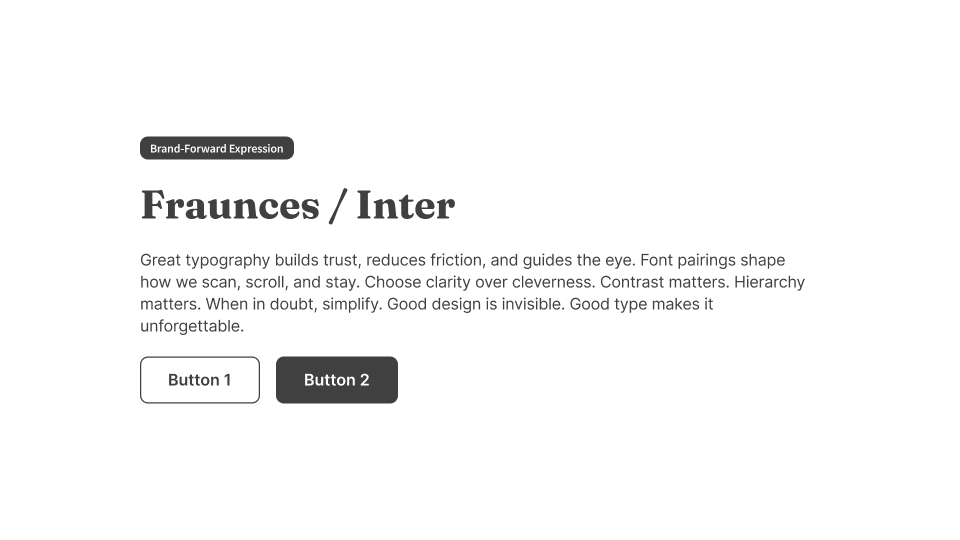
Fraunces / Inter: Retro-modern editorial meets functional digital clarity.
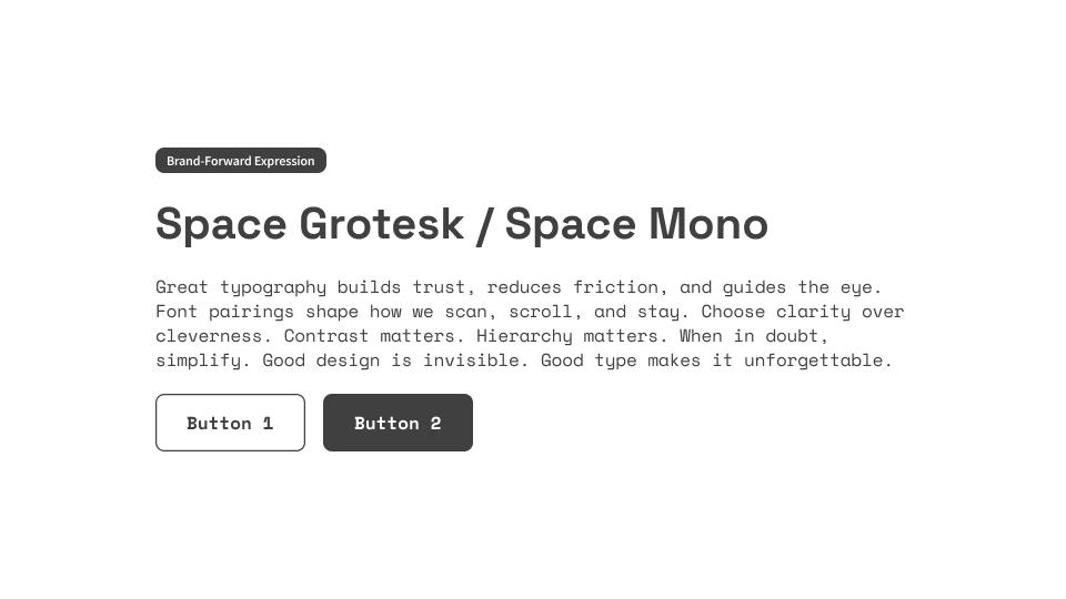
Space Grotesk / Space Mono: Ideal for AI tools, Web3 apps, or crypto dashboards.
♿ Accessibility Matters
If you’re not designing for accessibility, you’re not designing for real users.
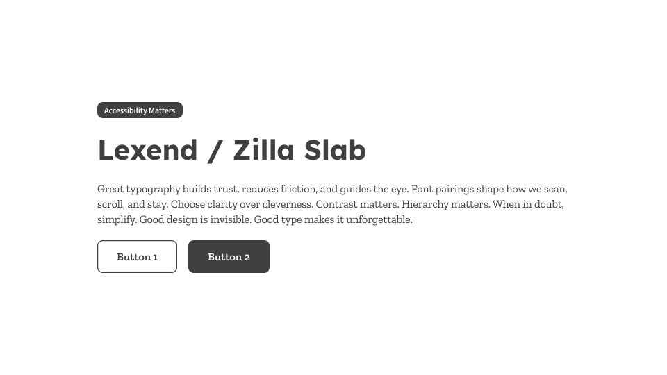
Lexend / Zilla Slab: Lexend was built from research on reading speed and comprehension. Zilla Slab adds friendly structure while maintaining clarity.
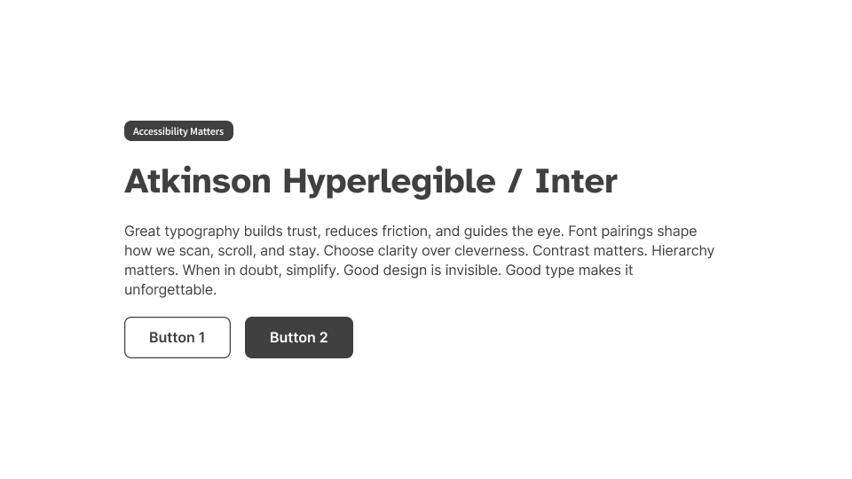
Atkinson Hyperlegible / Inter: Designed with the Braille Institute, this pairing improves character distinction without compromising UI usability.
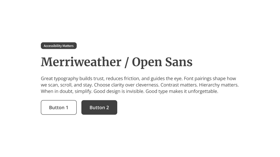
Merriweather / Open Sans: A classic accessibility combo. Merriweather’s tall x-height supports paragraph scanning. Open Sans is crisp at any size.
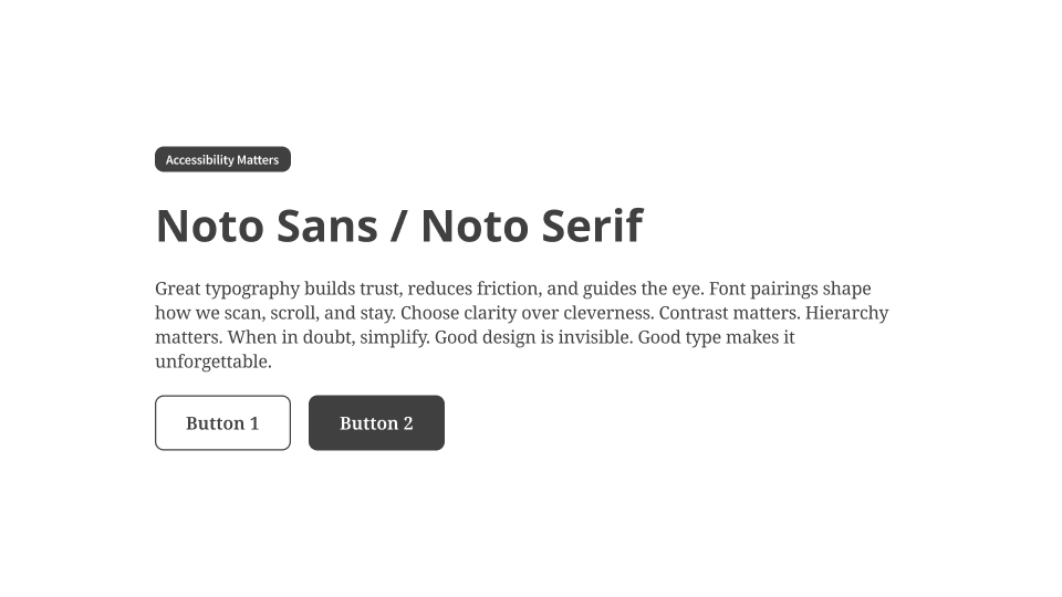
Noto Sans / Noto Serif: Built to support over 1,000 languages. Eliminates missing glyphs and ensures consistent multilingual typography.
🔥 Trend-Forward Pairings for 2025
Modern, original, and just off the beaten path.
These pairings are rising fast in product design circles, combining freshness, flexibility, and strong UI legibility. Whether you’re working on a bold brand launch, a digital-first tool, or a global platform, these fonts bring edge without losing clarity.
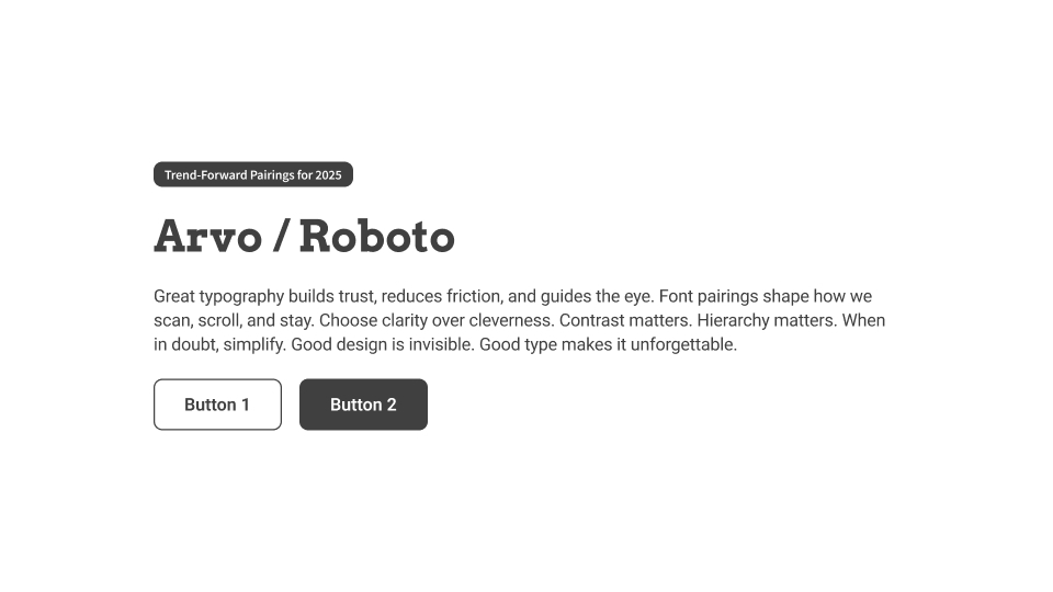
Arvo / Roboto: Structured slab headers with Roboto’s familiar efficiency in body text.
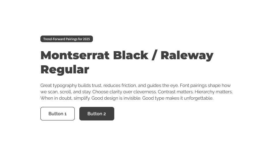
Montserrat Black / Raleway Regular: A striking hero pairing. Bold presence up top, elegant rhythm below.
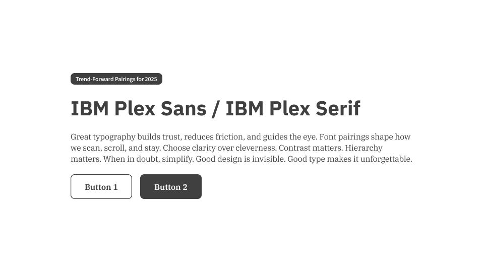
IBM Plex Sans / IBM Plex Serif: Superfamily harmony. Modern yet editorial—great for enterprise tools.
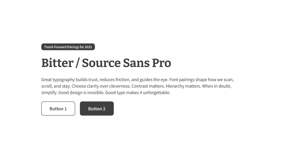
Bitter / Source Sans Pro: Editorial tone with high legibility. Ideal for education, publishing, and NGOs.
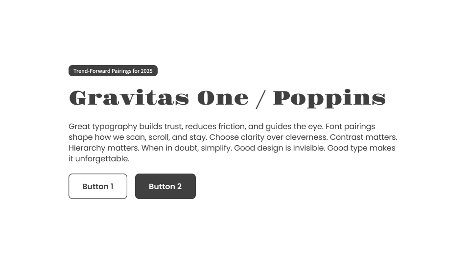
Gravitas One / Poppins: Vintage flair meets clean geometry. Perfect for bold brand moments.
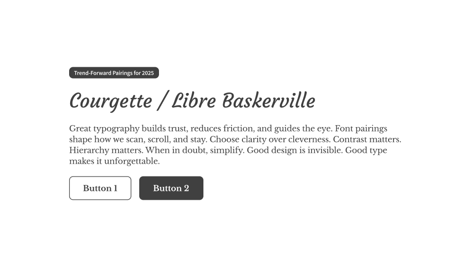
Courgette / Libre Baskerville: Approachable italics with grounded body text. Great for lifestyle or creative sites.
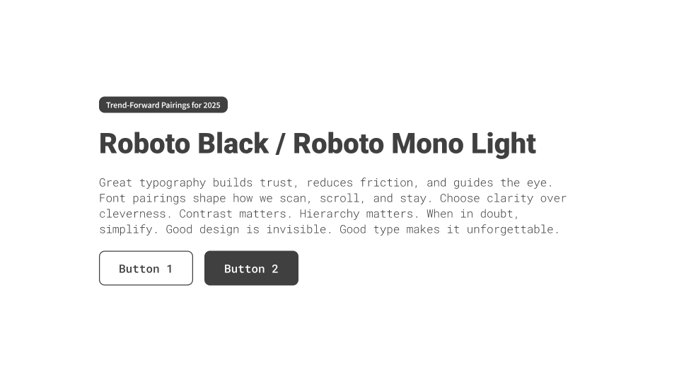
Roboto Black / Roboto Mono Light: Dev-ready and consistent. Use Black for headers, Mono for code and data.
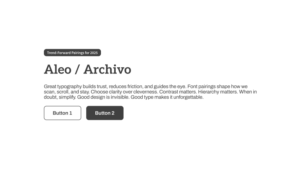
Aleo / Archivo: A soft serif and geometric sans combo that feels modern but friendly.
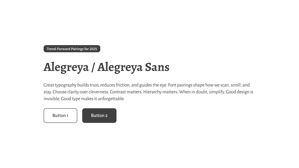
Alegreya / Alegreya Sans: Designed for long-form content. Strong in publishing, education, and documentation.
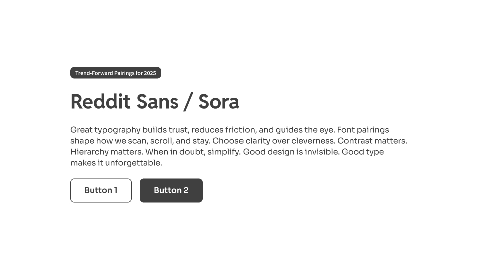
Reddit Sans / Sora: Built for social platforms and community UIs. Friendly and clean.
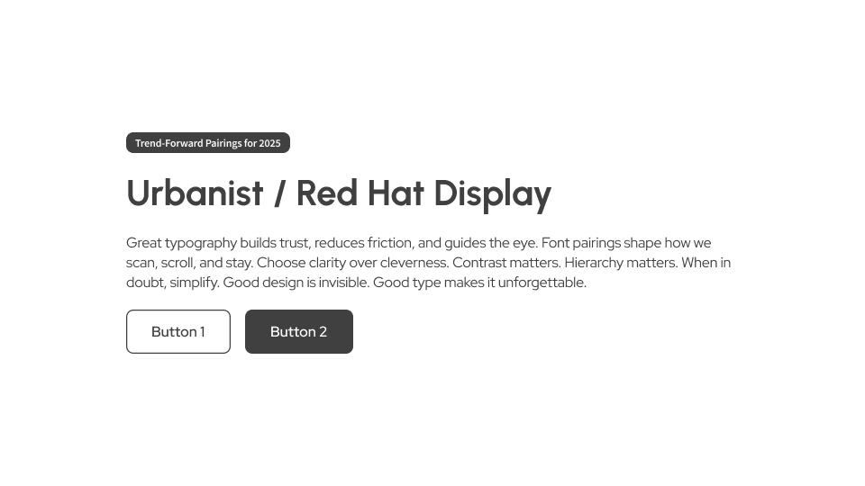
Urbanist / Red Hat Display: Minimalism with just enough personality. Strong in fintech, dashboards, or marketing.
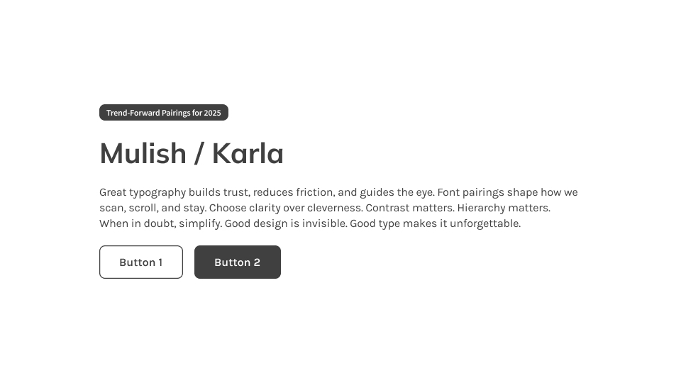
Mulish / Karla: Adaptable and calm. Ideal for wellness, health tech, or clean SaaS experiences.
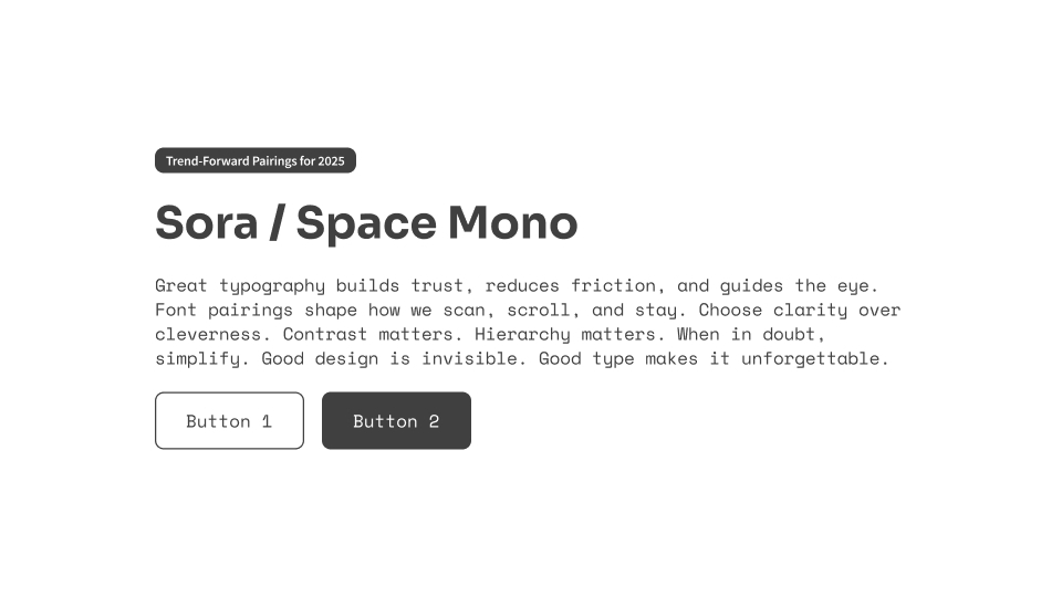
Sora / Space Mono: Crisp and open for digital tools. Space Mono brings structure to supporting elements.
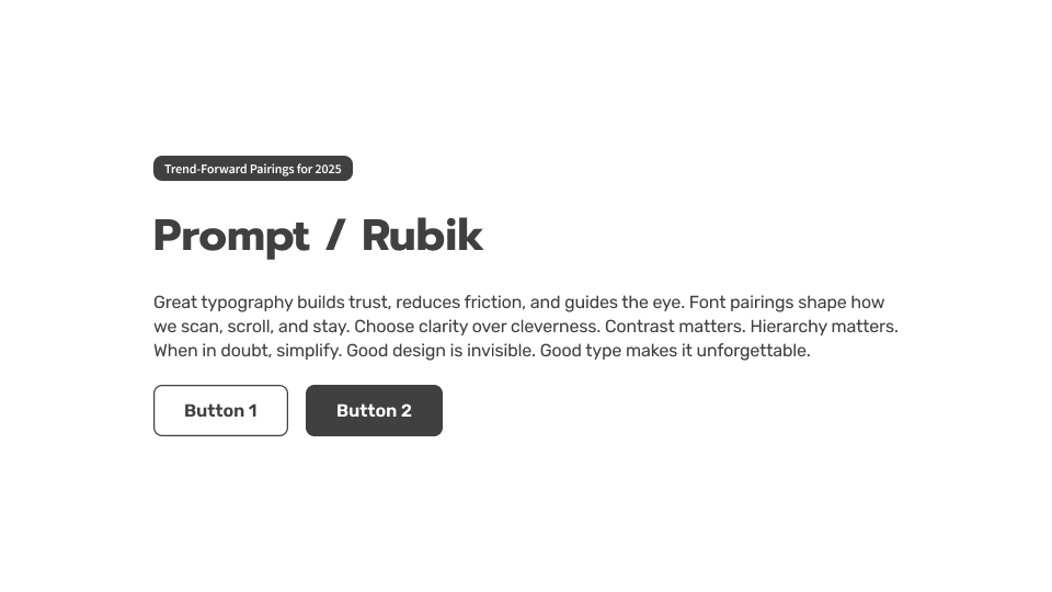
Prompt / Rubik: Rounded and playful. Great for youth-facing products and edtech.
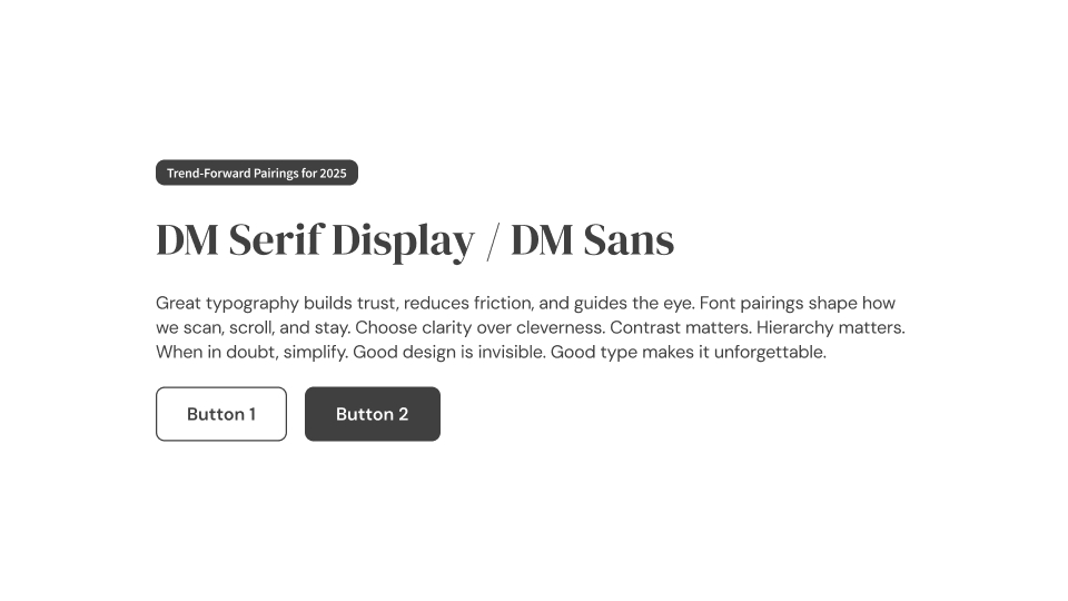
DM Serif Display / DM Sans: Elegant and expressive headers with clean, modern paragraphs. Works well in editorial or marketing design.
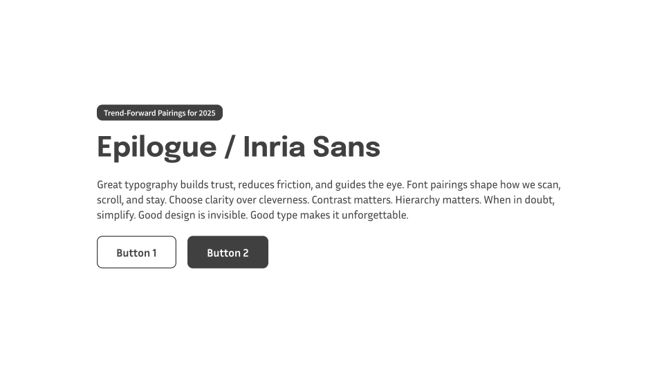
Epilogue / Inria Sans: Slightly quirky, highly usable. Ideal for portfolios, studios, or lightweight branding.
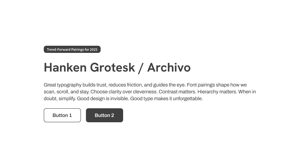
Hanken Grotesk / Archivo: Open and highly readable. Excellent for dashboards and structured admin tools.
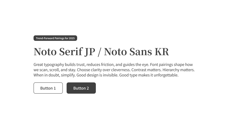
Noto Serif JP / Noto Sans KR: Seamless pairing for Japanese and Korean UI. Designed for consistency across scripts.

It’s Not Just Blur. It’s Optics
🧊 How to Create a Liquid Glass Button in Figma Simulating Apple’s Liquid Glass effect—with op

The Interface Isn’t Missing
It’s Invisible UX — and it’s changing how we design everything The interface isn’t missing.

It’s Not a File. It’s a Conversation.
A breakdown of what makes design-to-dev handoff smooth, respectful, and scalable. Design-to-dev hand