Ortu Branding
Visual Identity, Logo Design, Industrial Sector
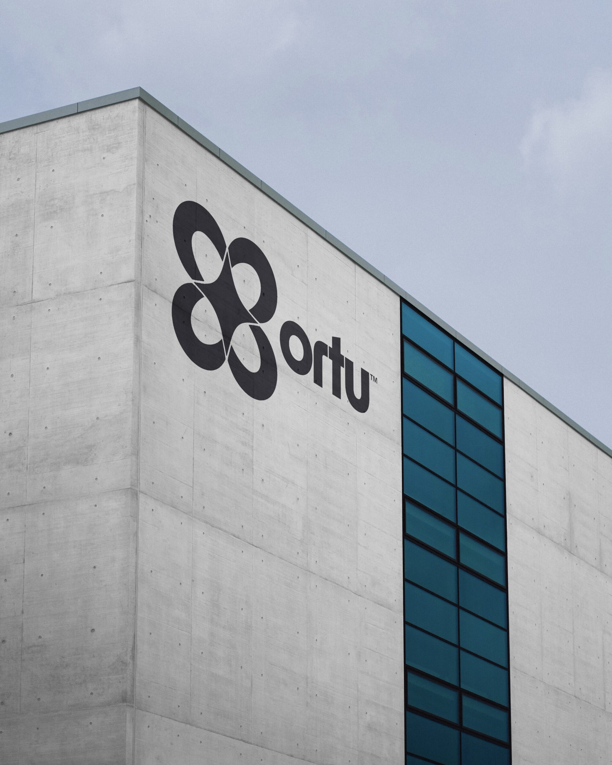
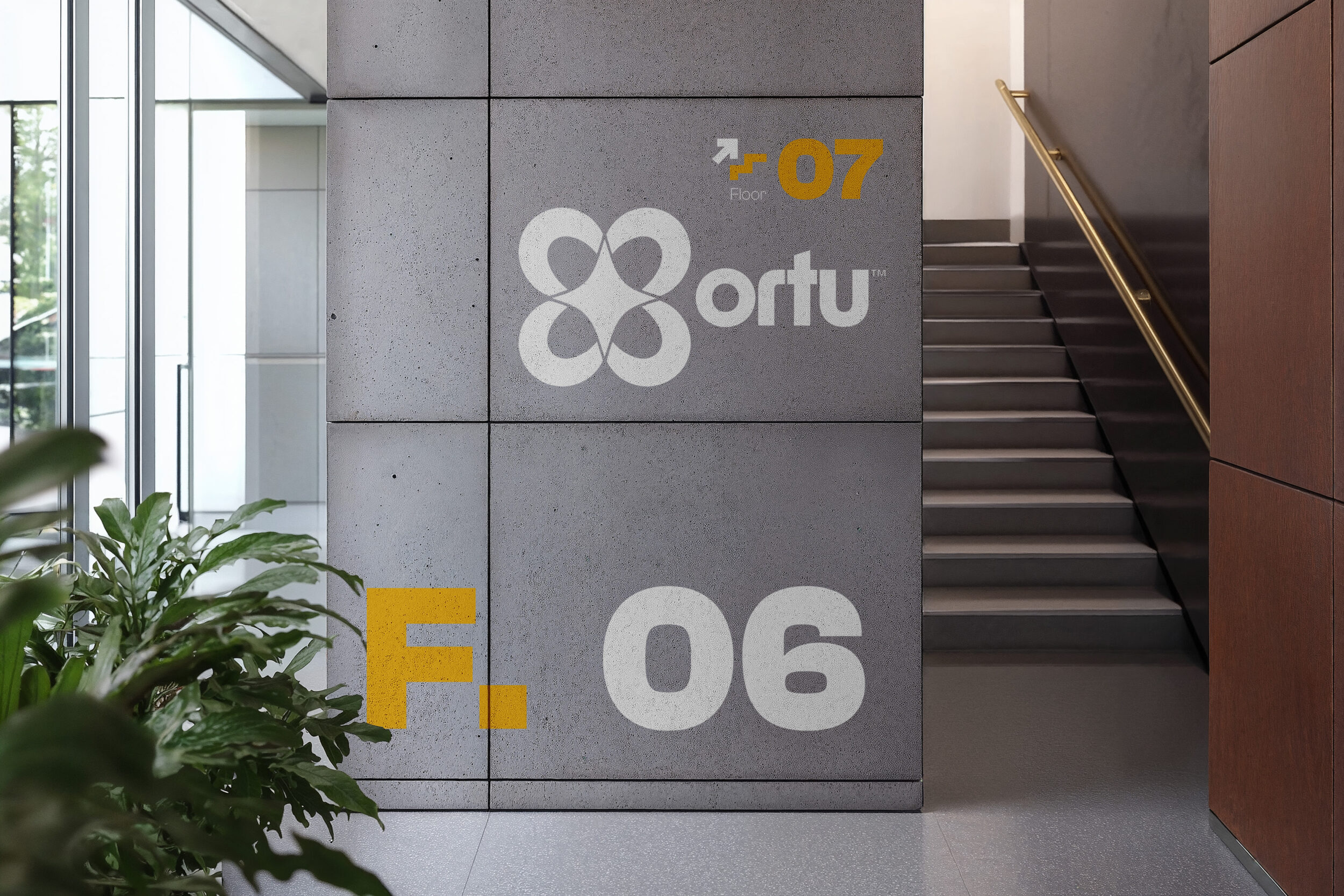
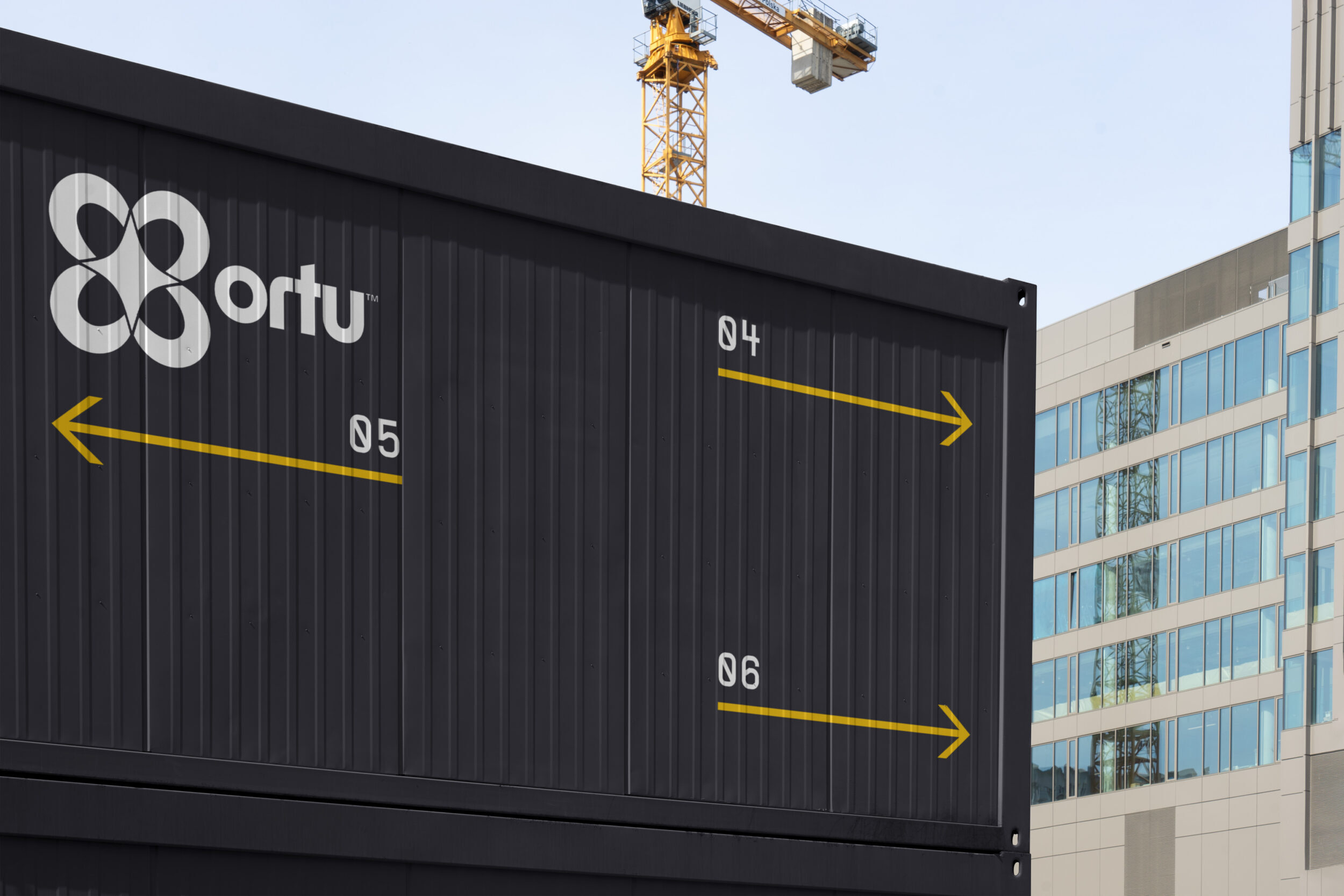
Ortu is a conceptual brand created for a fictional company operating in the industrial automation and manufacturing space. The identity was designed to reflect strength, precision, and adaptability—qualities essential to the sector and its technologies.
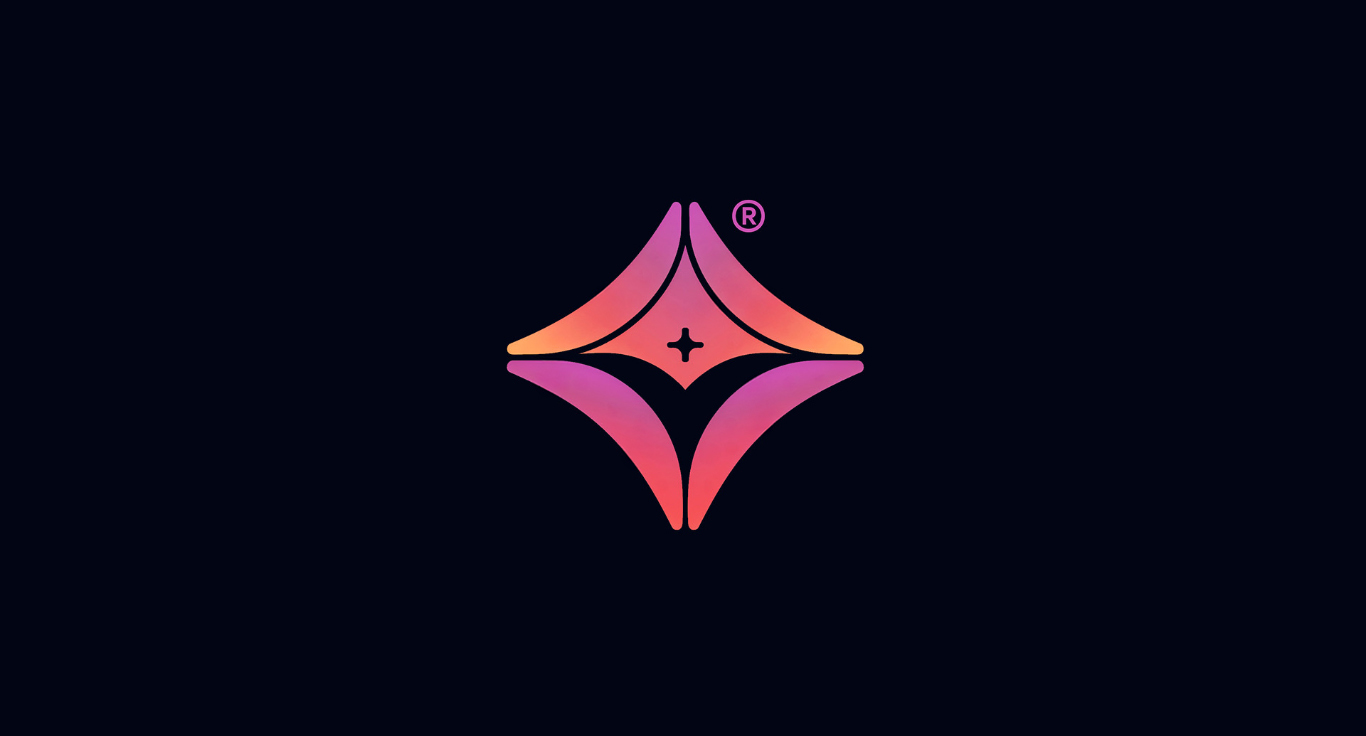
The logomark is a geometric symbol formed by four interlocking shapes, each resembling a stylized loop or gear segment. The negative space in the center creates a sharp, dynamic star, symbolizing energy, coordination, and high-performance output. The symmetry of the design hints at engineered precision and system integration—core to Ortu’s imagined service offering.
The logotype complements the mark with a custom, rounded sans-serif that balances approachability with technical clarity. The softened terminals and bold structure convey both reliability and forward-thinking innovation.
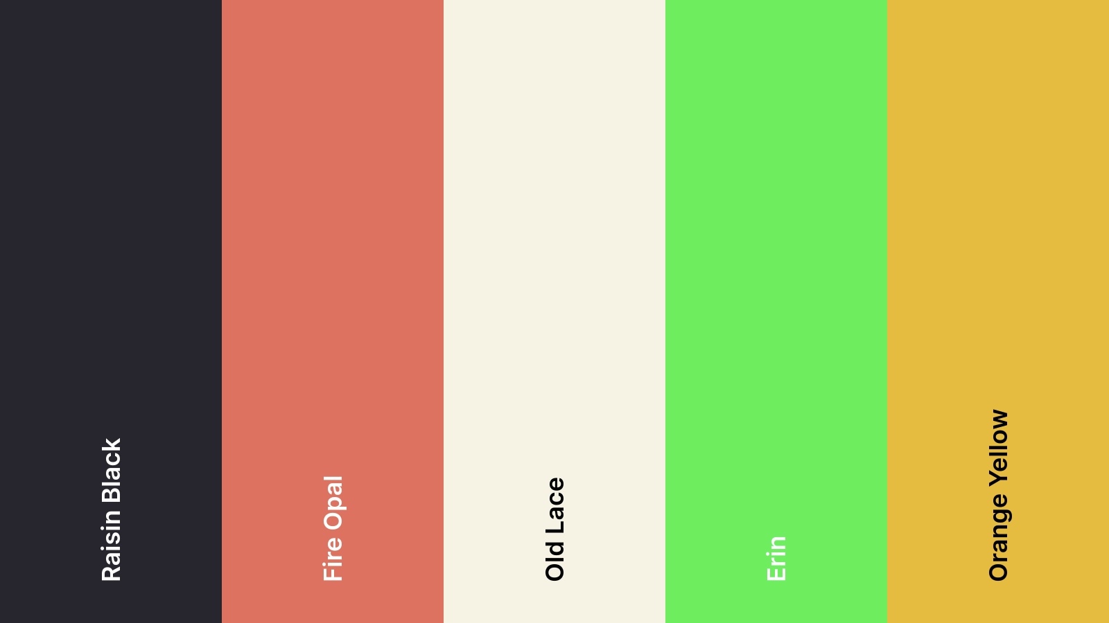
The identity is designed for high versatility across applications: from signage in large industrial environments to digital dashboards and embossed equipment panels. The mark scales well and remains distinct in both monochrome and full-colour settings.
The name Ortu—derived from the Latin root for “origin” or “rising”—reinforces the idea of foundation, growth, and engineered beginnings. It frames the brand as a source of transformation within high-tech manufacturing and automation sectors.
This concept showcases how minimal forms, strategic spacing, and typographic restraint can deliver a powerful, scalable brand system with industrial-grade impact.
The Draft
Event Concept / Brand Activation / Hockey Culture Engagement The Draft: Rink Edition was a concept f
Tempus Branding
Logo Design, Visual Identity System Tempus is a conceptual branding project for a modern time-tracki
Noctis Labs Branding
A refined, cosmic-inspired identity built for a space exploration manufacturer. The design pairs min


