

Kawaiicons – Icon Pack Design
Created Kawaiicons, a playful and colorful icon pack featuring 42 unique designs. This personal proj

Blockbase DeFi Dashboard for Power Users
Designed for Yield. Built for Clarity. This one-page DeFi dashboard concept targets intermediate to
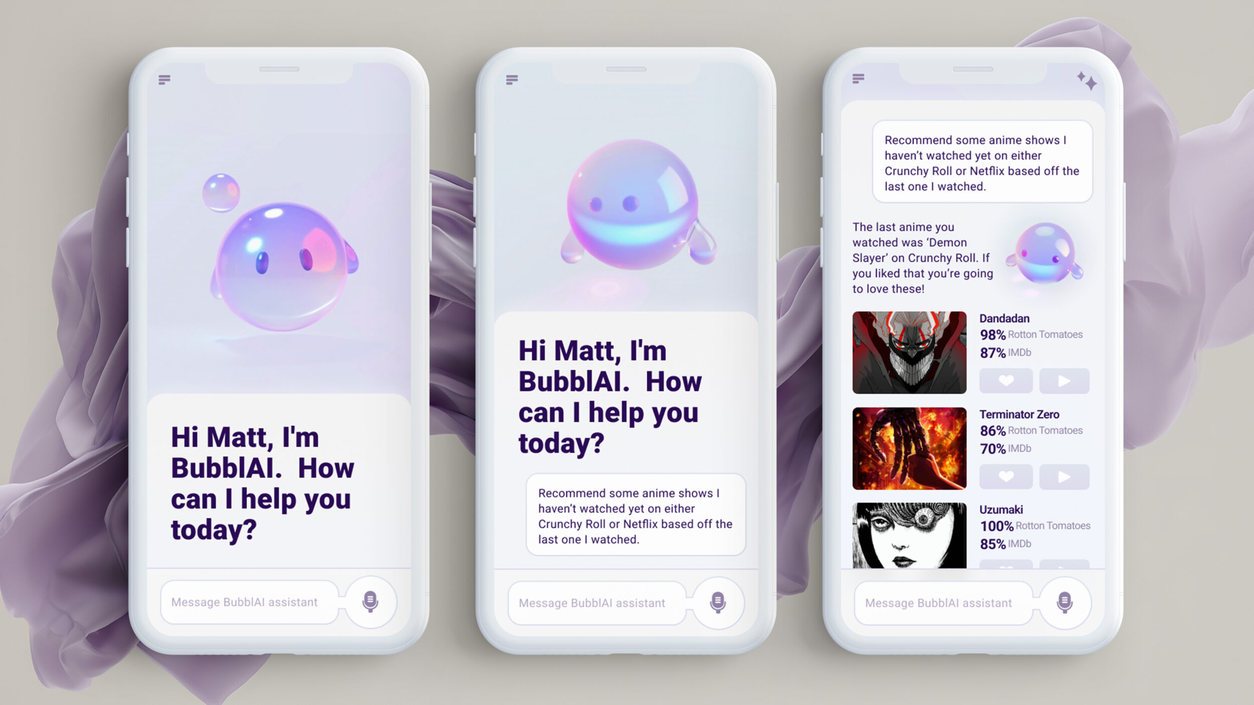
BubblAI – AI Assistant App
BubblAI is a playful AI assistant concept that transforms everyday interactions into something joyfu