Always Bet on “Almost” Black
A Product Designer’s Guide to Better Blacks
🎨 BLACK ISN’T JUST BLACK
Every few months, someone opens a design file and thinks: you know what this needs? Pure, unfiltered, soul-crushing #000000.
And every time, I sigh. Because #000000 isn’t just harsh. It’s lazy.
Let’s clear this up. Black is a colour. Don’t let the “absence of light” crew fool you. In pigment, print, and pixels, black always carries something with it. A hint of navy. A touch of crimson. An undertone of green or violet. Pure black rarely exists in the real world.
And on a screen? It shouldn’t.
🧠 WHY #000000 FAILS UX
In light mode, #000000 doesn’t feel crisp. It feels brittle. Harsh. It creates max contrast with none of the nuance. In dark mode, it turns into a void. Not a deep, rich one. Just emptiness.
It flattens hierarchy. It deadens your interface. And worst of all? It feels like a default. Like no one thought about it.
The problem isn’t just visual. It’s biological.
That extreme contrast between #000000 and #FFFFFF strains the eyes over time. Your retina has to constantly adjust between bright and dark. It causes fatigue and discomfort, especially on backlit screens. Clarity isn’t comfort. Sharpness isn’t readability.
And there’s a name for that blur users get with white text on black backgrounds. It’s called the halo effect. It’s especially common for people with astigmatism or myopia. That’s not a rare edge case. Nearly half the population is affected.
Even users with perfect vision aren’t off the hook. The real issue often isn’t the black. It’s the white. Pure white (#FFFFFF) backgrounds are overly bright, cause glare, and amplify contrast fatigue.
🛠 BETTER ALTERNATIVES
Designers who care don’t use pure black. They reach for tone, depth, and control. These are the MVPs of almost-black:

Reliable, accessible near-blacks for containers, chrome, text, and background elements. These shades balance contrast and readability without the visual harshness of pure black.
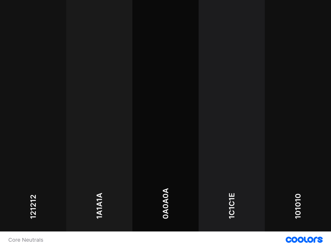
CORE NEUTRALS:
These are your functional near-blacks. Clean, consistent, and dependable. Designed for containers, dark themes, text, and anything that needs to feel intentional without calling attention to itself.
→ View Core Neutrals on Coolors
- #121212 – Charcoal Google’s Material standard. Clean and familiar.
- #1A1A1A – Cinder A balanced neutral that feels deliberate.
- #0A0A0A – Jet Deep and smooth. Great for shadows and dividers.
- #1C1C1E – Onyx Apple’s dark UI base. Cool and understated.
- #101010 – Eclipse Minimal, premium, and easy to pair.

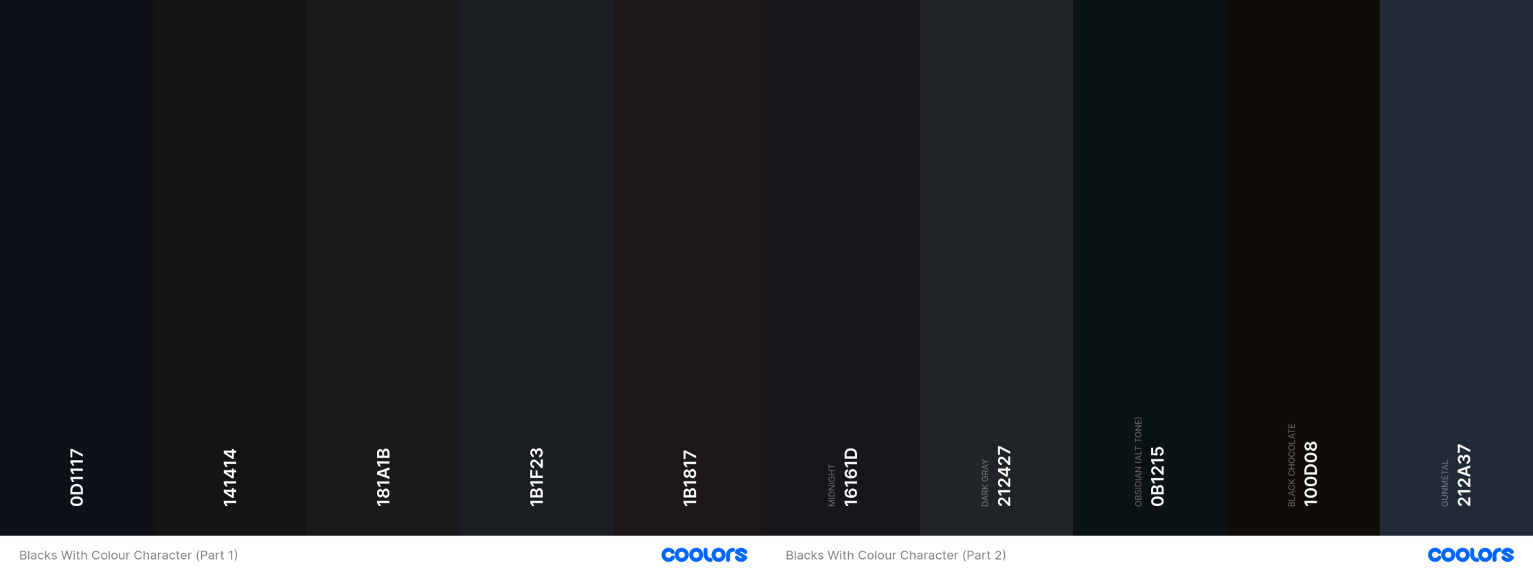
Ten near-blacks that actually behave like colours. These aren’t defaults. They’re moody, shaded, and full of personality. Shown in two parts because Coolors can’t handle this much range in one go.
WITH COLOUR CHARACTER:
These aren’t your default dark grays. Each of these “almost blacks” carries a subtle undertone—warmth, chill, depth, or mystery. Use them for polish and personality.
→ View Blacks with Colour Character Part 1 on Coolors
→ View Blacks with Colour Character Part 2 on Coolors
- #0D1117 – Obsidian Cold, techy, and quietly authoritative.
- #141414 – Basalt Slightly warm. Feels natural and grounded.
- #181A1B – Graphite Green-black tension. Subtle and earthy.
- #1B1F23 – Slate Black Leans cool. Great for dev tools or dashboards.
- #1B1817 – Sienna Black Tinted with warmth. Editorial and expressive.
- #16161D – Midnight Just a hint of blue. Cinematic and moody.
- #212427 – Dark Gray Slightly cool. Ideal for text-heavy UIs.
- #0B1215 – Obsidian (alt tone) Bleeds blue-black. Stylish and severe.
- #100D08 – Black Chocolate Deep and rich. Textural without being loud.
- #212A37 – Gunmetal Blue-toned steel. Reserve this for high-trust surfaces.
Want to go further? Try tinting your near-black with your brand’s primary hue. A red-leaning black in a red-toned UI ties everything together without shouting.
✨ MAKE IT INTENTIONAL
Great design isn’t about choosing the darkest black. It’s about choosing the right black.
One that performs across light and dark themes. One that reduces friction instead of introducing it. One that supports hierarchy and accessibility without wrecking your vibe.
Yes, small lightweight body text may need stronger contrast. But even then, #000000 shouldn’t be your default. And more often than not, the real villain is the background. White doesn’t need to be pure white. Try warming it slightly or toning it down. Your users will feel the difference, even if they can’t articulate it.
Accessibility isn’t one-size-fits-all either. Users with low vision might need pure black or high-contrast modes. That’s valid. But users with normal vision shouldn’t suffer for it. Inclusion means offering options.
Also, if you’re still designing to WCAG 2 contrast ratios, it’s time to level up. Tools like APCA reflect how humans actually perceive contrast. The future is perceptual, not mathematical.
And remember: black-on-white is not sacred. It’s a holdover from print. Your screen is not a sheet of paper. Stop designing like it is.
So next time your cursor hovers over #000000, pause. There’s almost always a better black.
Users Who Never Sleep
Why AI agents are a new audience, and what they demand from our tools There’s a new kind of user i
It’s Not Code. It’s Vibecode.
Why the AI shift in design and development needs structure, not just speed. Vibecoding is transformi
Stop Simulating. Start Listening.
Why disability simulations fail, and what product designers can do instead 👁️ Disability simula


