A foggy shoreline at dawn where a path of rough stepping stones gradually becomes more refined as it disappears into the mist, symbolizing the evolution of taste and restraint in design.

Originality Ages Faster Than Restraint

Originality is one of design’s most seductive qualities because it announces itself immediately.

You notice the unexpected interaction, the unusual interface, the visual language that feels unlike anything else on the market. It creates an instant impression that you’re looking at something new.

But new and lasting are not the same thing.

The longer I spend around design, the more convinced I’ve become that originality has a shorter lifespan than restraint. Originality is often defined by contrast. It exists because something feels different from what came before it. Restraint is built on judgment: knowing what deserves attention, what creates clarity, and what can be removed without weakening the experience.

The decisions people notice first are rarely the ones they appreciate longest.

The work that endures usually isn’t remembered because it surprised us. It endures because, years later, its decisions still feel inevitable.

Taste Ages Faster Than Technology

Technology has a direction. It moves forward through capability: faster processors, better rendering, smarter models, more powerful tools.

Taste doesn’t.

Taste moves through collective agreement. A visual language emerges, spreads, becomes familiar, and eventually loses the quality that made it feel distinctive in the first place.

I experienced this while rebuilding a dashboard last year. The engineering was solid. The architecture was sound. Nothing about the underlying technology had become irrelevant. But visually, the product felt anchored to another moment. Rounded gradient buttons, layered shadows, and visual treatments that had felt inevitable only a few years earlier now carried the unmistakable weight of their era. Nobody had touched the backend. The functionality hadn’t changed.

Its visual confidence had expired.

The difficult thing about taste is that it rarely announces itself as taste. While we’re living inside a design movement, it feels like common sense. Every generation quietly assumes its visual language represents good design rather than a temporary agreement about what good design looks like.

You can already watch this happening across AI products. Many have converged around the same visual vocabulary: violet-to-blue gradients, glowing particles, oversized prompt boxes, soft illustrations, expansive white space. None of these decisions are individually wrong. They emerged because thousands of teams were responding to the same cultural moment, consuming similar references, and solving similar problems.

That’s how design languages spread.

Eventually, they become the thing the next generation moves away from.

Restraint ages differently because it depends less on the moment surrounding it.

The Things You Learn to See

One of the reasons restraint becomes more valuable with experience is that expertise changes what we notice.

When we first encounter a craft, we’re naturally drawn toward visible complexity. More features. More mechanisms. More evidence of effort. As our understanding deepens, our attention shifts toward proportion, hierarchy, material choices, rhythm, and the decisions that were intentionally left out.

I’ve noticed this in myself through watches.

When I first became interested in them, I gravitated toward complexity: chronographs, date windows, power reserve indicators, visible mechanisms. The more information a watch displayed, the more impressive it seemed.

Over time, that changed.

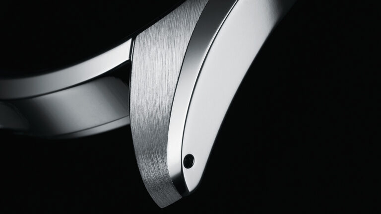
I became more interested in the quieter decisions: the symmetry of a dateless dial, the precision of a Zaratsu-polished edge catching the light, the confidence required to leave empty space untouched. The watches I admire most now are rarely the ones trying to demonstrate the most. They’re the ones where every decision feels considered.

Close-up of a Grand Seiko case showing a Zaratsu-polished bevel meeting a finely brushed lug, highlighting the crisp transitions, distortion-free mirror finish, and precise craftsmanship.
A close-up of Grand Seiko's signature Zaratsu polishing, where distortion-free mirror finishing and precise brushed surfaces meet to create razor-sharp transitions. Image courtesy of Grand Seiko.

I developed better taste because I learned to recognize a different kind of complexity: the judgment involved in deciding what didn’t belong.

I’ve started to think that’s what expertise really is. Not accumulating more preferences, but becoming more sensitive to the quality of decisions that most people never notice.

People often explain timeless design by naming famous designers—Dieter Rams, Jony Ive, Massimo Vignelli, Charles and Ray Eames—but the more interesting question is what their work reveals when you look closely.

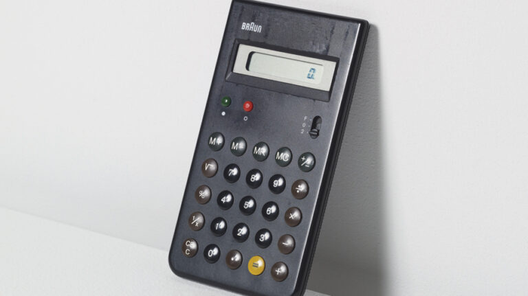
Pick up a Braun ET66 calculator. What makes it remarkable isn’t that it’s minimal. Plenty of products are minimal. It’s that every element feels as though it earned its place. The typography doesn’t compete with the buttons. The layout doesn’t introduce unnecessary hierarchy. Nothing is trying to become the hero.

The object feels confident because nothing is fighting for your attention.

Braun ET66 calculator designed by Dietrich Lubs and Dieter Rams, featuring a minimalist black enclosure, circular tactile buttons, and a clean functional layout that became an icon of industrial design.
The Braun ET66 calculator, designed by Dietrich Lubs under the direction of Dieter Rams, remains a benchmark for restrained industrial design. Image courtesy of Port Magazine.

Open Linear and press Command-K.

The command palette appears almost instantly. The interaction doesn’t celebrate itself. There’s no unnecessary transition reminding you something happened. Somewhere, someone decided that speed was part of the product’s personality, and every unnecessary millisecond became something worth removing.

Linear's Command Palette opened with the keyboard shortcut Command-K, showing the quick actions menu that enables fast keyboard-first navigation and workflow management.
Linear's Command Palette exemplifies a keyboard-first design philosophy, prioritizing speed and reducing friction through restrained interaction design. Image courtesy of Linear.

Neither example feels enduring because it rejected trends.

They endure because clarity consistently won over expression.

The Cost of Leaving Things Out

I learned a version of that lesson during a product review years ago.

I presented two directions for the same product. One was expressive: richer illustrations, more transitions, more moments where the interface visibly demonstrated the amount of design work behind it. The other removed almost all of that, relying on typography, spacing, hierarchy, and interaction quality to carry the experience.

It didn’t take long before the room settled on the first direction.

It looked more complete. More premium. More obviously designed. The quieter direction felt unfinished, as though removing things had somehow reduced the amount of design rather than increased the amount of judgment.

We shipped the quieter version anyway.

Months later, nobody talked about the illustrations we had removed or the transitions we never built. They talked about how easy the product felt to understand. How quickly they could complete tasks. The decisions that created the most debate during review had disappeared into the experience itself.

Restraint is expensive.

Not financially.

Psychologically.

It asks designers to leave behind ideas they’re proud of. It asks stakeholders to trust work that often looks less impressive in a review. It asks teams to measure success by what users never notice instead of what they immediately admire.

That’s a difficult trade to make.

Judgment Is the Scarce Resource

Working with AI has made this even more interesting.

One of the most surprising things about these tools isn’t their ability to generate ideas. It’s how little emotional attachment they have to them. They’ll happily remove the interaction you’ve spent three days refining or simplify the paragraph you’ve convinced yourself can’t lose another word.

Sometimes they’re wrong.

Sometimes they’re exposing the fact that you’re protecting a decision simply because you’ve invested in it.

That perspective is surprisingly useful.

AI doesn’t struggle with restraint because it doesn’t experience the emotional cost of letting ideas go.

The challenge has never been removing things.

The challenge is knowing what deserves to remain.

That requires taste. It requires context. It requires judgment.

As originality becomes easier to manufacture, restraint becomes harder to imitate. One comes from exploration. The other comes from knowing, after exploring hundreds of possibilities, which ones are worth leaving behind.

That’s why I believe originality ages faster than restraint.

Because restraint is what remains after the excitement of originality has faded.